Chip
Examples#
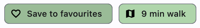
Assist chips#
Assist chips are chips with leading icon and on_click event specified.
They represent smart or automated actions that appear dynamically and contextually in a UI.
An alternative to assist chips are buttons, which should appear persistently and consistently.
import flet as ft


def main(page: ft.Page):
    def handle_chip1_click(e: ft.Event[ft.Chip]):
        e.control.label.value = "Saved to favorites"
        e.control.leading = ft.Icon(ft.Icons.FAVORITE_OUTLINED)
        e.control.disabled = True
        page.update()

    async def handle_chip2_click(e: ft.Event[ft.Chip]):
        await page.launch_url("https://maps.google.com")
        page.update()

    page.add(
        ft.Row(
            controls=[
                ft.Chip(
                    label=ft.Text("Save to favourites"),
                    leading=ft.Icon(ft.Icons.FAVORITE_BORDER_OUTLINED),
                    bgcolor=ft.Colors.GREEN_200,
                    disabled_color=ft.Colors.GREEN_100,
                    autofocus=True,
                    on_click=handle_chip1_click,
                ),
                ft.Chip(
                    label=ft.Text("9 min walk"),
                    leading=ft.Icon(ft.Icons.MAP_SHARP),
                    bgcolor=ft.Colors.GREEN_200,
                    on_click=handle_chip2_click,
                ),
            ]
        )
    )


ft.run(main)
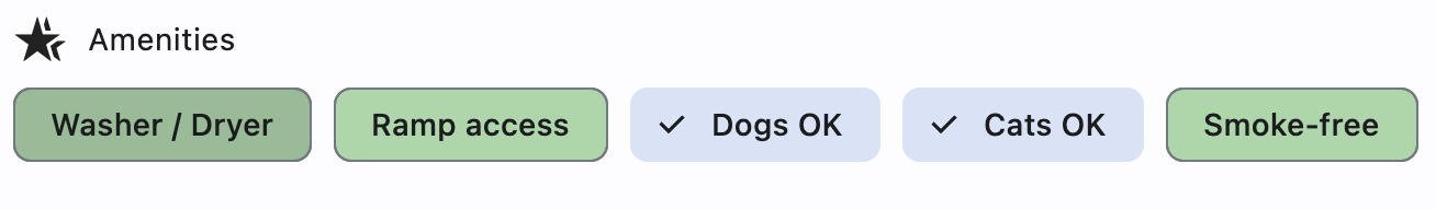
Filter chips#
Filter chips are chips with on_select event specified.
They use tags or descriptive words provided in the label to filter content.
They can be a good alternative to switches or checkboxes.
import flet as ft


def main(page: ft.Page):
    def handle_amenity_selection(e: ft.Event[ft.Chip]):
        page.update()

    amenities = ["Washer / Dryer", "Ramp access", "Dogs OK", "Cats OK", "Smoke-free"]

    page.add(
        ft.Row(controls=[ft.Icon(ft.Icons.HOTEL_CLASS), ft.Text("Amenities")]),
        ft.Row(
            controls=[
                ft.Chip(
                    label=ft.Text(amenity),
                    bgcolor=ft.Colors.GREEN_200,
                    disabled_color=ft.Colors.GREEN_100,
                    autofocus=True,
                    on_select=handle_amenity_selection,
                )
                for amenity in amenities
            ]
        ),
    )


ft.run(main)
Bases: LayoutControl
Chips are compact elements that represent an attribute, text, entity, or action.
| RAISES | DESCRIPTION |
|---|---|
AssertionError
|
If |
AssertionError
|
animate_align: AnimationValue | None = None
Enables implicit animation of the [align][flet.LayoutControl.] property.
More information here.
animate_margin: AnimationValue | None = None
Enables implicit animation of the [margin][flet.LayoutControl.] property.
More information here.
animate_offset: AnimationValue | None = None
Enables implicit animation of the [offset][flet.LayoutControl.] property.
More information here.
animate_opacity: AnimationValue | None = None
Enables implicit animation of the [opacity][flet.LayoutControl.] property.
More information here.
animate_position: AnimationValue | None = None
Enables implicit animation of the positioning properties
([left][flet.LayoutControl.], [right][flet.LayoutControl.],
[top][flet.LayoutControl.] and [bottom][flet.LayoutControl.]).
More information here.
animate_rotation: AnimationValue | None = None
Enables implicit animation of the [rotate][flet.LayoutControl.] property.
More information here.
animate_scale: AnimationValue | None = None
Enables implicit animation of the [scale][flet.LayoutControl.] property.
More information here.
aspect_ratio: Number | None = None
The aspect ratio of the control. It is defined as the ratio of the width to the height.
autofocus: bool = False
Whether this chip will be selected as the initial focus.
If there is more than one control on a page with autofocus set, then the first one added to the page will get focus.
bgcolor: ColorValue | None = None
Color to be used for the unselected, enabled chip's background.
border_side: BorderSide | None = None
Defines the color and weight of this chip's outline.
bottom: Number | None = None
The distance that the child's bottom edge is inset from the bottom of the stack.
Note
Effective only if this control is a descendant of one of the following:
[Stack][flet.] control, [Page.overlay][flet.] list.
check_color: ColorValue | None = None
The color of this chip's check mark when a check mark is visible.
clip_behavior: ClipBehavior = NONE
The content will be clipped (or not) according to this option.
col: ResponsiveNumber = 12
If a parent of this control is a [ResponsiveRow][flet.],
this property is used to determine
how many virtual columns of a screen this control will span.
Can be a number or a dictionary configured to have a different value for specific
breakpoints, for example col={"sm": 6}.
This control spans the 12 virtual columns by default.
Dimensions
| Breakpoint | Dimension |
|---|---|
| xs | <576px |
| sm | ≥576px |
| md | ≥768px |
| lg | ≥992px |
| xl | ≥1200px |
| xxl | ≥1400px |
color: ControlStateValue[ColorValue] | None = None
The color that fills this chip in various ControlState.
delete_drawer_animation_style: AnimationStyle | None = None
The animation style for the delete_icon's animations.
delete_icon_size_constraints: BoxConstraints | None = None
The size constraints for the delete_icon control.
If None, it defaults to a minimum size of chip height or label height
(whichever is greater) and a padding of 8.0 pixels on all sides.
delete_icon_tooltip: str | None = None
The text to be used for this chip's delete_icon tooltip. If not provided or
provided with an empty string, the tooltip of the delete icon will not be displayed.
disabled: bool = False
Every control has disabled property which is False by default - control and all
its children are enabled.
Note
The value of this property will be propagated down to all children controls recursively.
disabled_color: ColorValue | None = None
The color used for this chip's background if it is disabled.
elevation: Number | None = None
A non-negative value which defines the size of the shadow below this chip.
Defaults to 0.
elevation_on_click: Number | None = None
The elevation to be applied on this chip relative to its parent during the press motion. This controls the size of the shadow below this chip.
Defaults to 8.0.
Note
Must be non-negative.
enable_animation_style: AnimationStyle | None = None
The animation style for the enable and disable animations.
Specifies whether/how this control should expand to fill available space in its parent layout.
More information here.
Note
Has effect only if the direct parent of this control is one of the following
controls, or their subclasses: [Column][flet.], [Row][flet.],
[View][flet.], [Page][flet.].
expand_loose: bool = False
Allows the control to expand along the main axis if space is available, but does not require it to fill all available space.
More information here.
Note
If expand_loose is True, it will have effect only if:
expandis notNoneand- the direct parent of this control is one of the following controls, or their
subclasses: [
Column][flet.], [Row][flet.], [View][flet.], [Page][flet.].
label_padding: PaddingValue | None = None
label_text_style: TextStyle | None = None
The style to be applied to this chip's label.
leading: Control | None = None
A Control to display to the left of this chip's label.
Typically the leading control is an Icon or a CircleAvatar.
leading_drawer_animation_style: AnimationStyle | None = None
The animation style for the leading control's animations.
leading_size_constraints: BoxConstraints | None = None
The size constraints for the leading control.
If None, it defaults to a minimum size of chip height or label height
(whichever is greater) and a padding of 8.0 pixels on all sides.
left: Number | None = None
The distance that the child's left edge is inset from the left of the stack.
Note
Effective only if this control is a descendant of one of the following:
[Stack][flet.] control, [Page.overlay][flet.] list.
offset: OffsetValue | None = None
Applies a translation transformation before painting the control.
The translation is expressed as an Offset scaled to the control's size.
So, Offset(x=0.25, y=0), for example, will result in a horizontal translation
of one quarter the width of this control.
Example
The following example displays container at 0, 0 top left corner of a stack as
transform applies -1 * 100, -1 * 100 (offset * control's size) horizontal and
vertical translations to the control:
on_animation_end: (
    ControlEventHandler[LayoutControl] | None
) = None
Called when animation completes.
Can be used to chain multiple animations.
The data property of the event handler argument contains the name
of the animation.
More information here.
on_click: ControlEventHandler[Chip] | None = None
Called when the user clicks on this chip.
Note
Cannot be specified together with on_select.
on_delete: ControlEventHandler[Chip] | None = None
Called when the user clicks on the delete_icon.
on_focus: ControlEventHandler[Chip] | None = None
Called when this chip has received focus.
on_select: ControlEventHandler[Chip] | None = None
opacity: Number = 1.0
Defines the transparency of the control.
Value ranges from 0.0 (completely transparent) to 1.0 (completely opaque
without any transparency).
padding: PaddingValue | None = None
The padding between the label and the outside shape.
Defaults to 8 logical pixels on all sides.
parent: BaseControl | None
The direct ancestor(parent) of this control.
It defaults to None and will only have a value when this control is mounted
(added to the page tree).
The Page control (which is the root of the tree) is an exception - it always
has parent=None.
right: Number | None = None
The distance that the child's right edge is inset from the right of the stack.
Note
Effective only if this control is a descendant of one of the following:
[Stack][flet.] control, [Page.overlay][flet.] list.
rotate: RotateValue | None = None
Transforms this control using a rotation around its center.
The value of rotate property could be one of the following types:
number- a rotation in clockwise radians. Full circle360°ismath.pi * 2radians,90°ispi / 2,45°ispi / 4, etc.Rotate- allows to specify rotationangleas well asalignment- the location of rotation center.
scale: ScaleValue | None = None
Scales this control along the 2D plane. Default scale factor is 1.0,
meaning no-scale.
Setting this property to 0.5, for example, makes this control twice smaller,
while 2.0 makes it twice larger.
Different scale multipliers can be specified for x and y axis, by setting
Control.scale property to an instance of Scale class.
Either scale or scale_x and scale_y could be specified, but not all of them.
select_animation_style: AnimationStyle | None = None
The animation style for the select and unselect animations.
selected: bool = False
If on_select event is specified, selected property is used to
determine whether this chip is selected or not.
selected_color: ColorValue | None = None
The color used for this chip's background when it is selected.
selected_shadow_color: ColorValue | None = None
The color used for this chip's background
when the elevation is greater than 0 and this chip is selected.
shadow_color: ColorValue | None = None
The color used for this chip's background
when the elevation is greater than 0 and this chip is not selected.
shape: OutlinedBorder | None = None
The shape of the border around this chip.
Defaults to ChipTheme.shape, or if that is resolves to
None, falls back to RoundedRectangleBorder(radius=8).
show_checkmark: bool = True
If on_select event is specified and chip is selected, show_checkmark
is used to determine whether or not to show a checkmark.
tooltip: TooltipValue | None = None
The tooltip ot show when this control is hovered over.
top: Number | None = None
The distance that the child's top edge is inset from the top of the stack.
Note
Effective only if this control is a descendant of one of the following:
[Stack][flet.] control, [Page.overlay][flet.] list.
visible: bool = True
Every control has visible property which is True by default - control is
rendered on the page. Setting visible to False completely prevents control (and
all its children if any) from rendering on a page canvas. Hidden controls cannot be
focused or selected with a keyboard or mouse and they do not emit any events.
Called once during control initialization to define its child controls. self.page is available in this method.