Container
Examples#
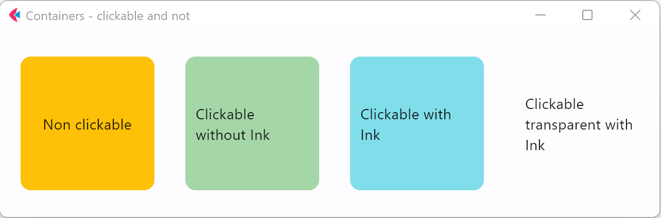
Clickable container#
import flet as ft


def main(page: ft.Page):
    page.title = "Container Example"
    page.theme_mode = ft.ThemeMode.LIGHT
    page.vertical_alignment = ft.MainAxisAlignment.CENTER
    page.horizontal_alignment = ft.CrossAxisAlignment.CENTER

    page.add(
        ft.Row(
            alignment=ft.MainAxisAlignment.CENTER,
            controls=[
                ft.Container(
                    content=ft.Text("Non clickable"),
                    margin=10,
                    padding=10,
                    alignment=ft.Alignment.CENTER,
                    bgcolor=ft.Colors.AMBER,
                    width=150,
                    height=150,
                    border_radius=10,
                ),
                ft.Container(
                    content=ft.Text("Clickable without Ink"),
                    margin=10,
                    padding=10,
                    alignment=ft.Alignment.CENTER,
                    bgcolor=ft.Colors.GREEN_200,
                    width=150,
                    height=150,
                    border_radius=10,
                    on_click=lambda e: print("Clickable without Ink clicked!"),
                ),
                ft.Container(
                    content=ft.Text("Clickable with Ink"),
                    margin=10,
                    padding=10,
                    alignment=ft.Alignment.CENTER,
                    bgcolor=ft.Colors.CYAN_200,
                    width=150,
                    height=150,
                    border_radius=10,
                    ink=True,
                    on_click=lambda e: print("Clickable with Ink clicked!"),
                ),
                ft.Container(
                    content=ft.Text("Clickable transparent with Ink"),
                    margin=10,
                    padding=10,
                    alignment=ft.Alignment.CENTER,
                    width=150,
                    height=150,
                    border_radius=10,
                    ink=True,
                    on_click=lambda e: print("Clickable transparent with Ink clicked!"),
                ),
            ],
        ),
    )


ft.run(main)
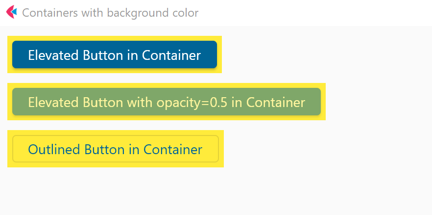
Background color#
import flet as ft


def main(page: ft.Page):
    page.title = "Containers with different background color"

    page.add(
        ft.Container(
            content=ft.Text("Container_1"),
            bgcolor="#FFCC0000",
            padding=5,
        ),
        ft.Container(
            content=ft.Text("Container_2"),
            bgcolor="#CC0000",
            padding=5,
        ),
        ft.Container(
            content=ft.Text("Container_3"),
            bgcolor=ft.Colors.RED,
            padding=5,
        ),
    )


ft.run(main)
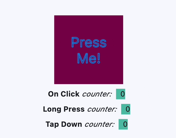
Handling clicks#
import flet as ft


def main(page: ft.Page):
    page.theme_mode = ft.ThemeMode.LIGHT
    page.vertical_alignment = ft.MainAxisAlignment.CENTER
    page.horizontal_alignment = ft.CrossAxisAlignment.CENTER
    lp_counter = 0
    cl_counter = 0
    td_counter = 0

    def on_click(e):
        nonlocal cl_counter
        cl_counter += 1
        t1.spans[-1] = ft.TextSpan(
            text=f"  {cl_counter}  ",
            style=ft.TextStyle(size=16, bgcolor=ft.Colors.TEAL_300),
        )
        page.update()

    def on_long_press(e):
        nonlocal lp_counter
        lp_counter += 1
        t3.spans[-1] = ft.TextSpan(
            text=f"  {lp_counter}  ",
            style=ft.TextStyle(size=16, bgcolor=ft.Colors.TEAL_300),
        )
        page.update()

    def on_tap_down(e):
        nonlocal td_counter
        td_counter += 1
        t2.spans[-1] = ft.TextSpan(
            text=f"  {td_counter}  ",
            style=ft.TextStyle(size=16, bgcolor=ft.Colors.TEAL_300),
        )
        page.update()

    c = ft.Container(
        bgcolor=ft.Colors.PINK_900,
        alignment=ft.Alignment.CENTER,
        padding=ft.Padding.all(10),
        height=150,
        width=150,
        on_click=on_click,
        on_long_press=on_long_press,
        on_tap_down=on_tap_down,
        content=ft.Text(
            "Press Me!",
            text_align=ft.TextAlign.CENTER,
            style=ft.TextStyle(
                size=30,
                # weight=ft.FontWeight.BOLD,
                foreground=ft.Paint(
                    color=ft.Colors.BLUE_700,
                    stroke_cap=ft.StrokeCap.BUTT,
                    stroke_width=2,
                    stroke_join=ft.StrokeJoin.BEVEL,
                    style=ft.PaintingStyle.STROKE,
                ),
            ),
            theme_style=ft.TextThemeStyle.DISPLAY_MEDIUM,
        ),
    )
    t1 = ft.Text(
        spans=[
            ft.TextSpan(
                text="On Click", style=ft.TextStyle(size=16, weight=ft.FontWeight.BOLD)
            ),
            ft.TextSpan(text=" counter:  ", style=ft.TextStyle(size=16, italic=True)),
            ft.TextSpan(
                text=f"  {cl_counter}  ",
                style=ft.TextStyle(size=16, bgcolor=ft.Colors.TEAL_300),
            ),
        ]
    )
    t2 = ft.Text(
        spans=[
            ft.TextSpan(
                text="Tap Down", style=ft.TextStyle(size=16, weight=ft.FontWeight.BOLD)
            ),
            ft.TextSpan(text=" counter:  ", style=ft.TextStyle(size=16, italic=True)),
            ft.TextSpan(
                text=f"  {td_counter}  ",
                style=ft.TextStyle(size=16, bgcolor=ft.Colors.TEAL_300),
            ),
        ]
    )
    t3 = ft.Text(
        spans=[
            ft.TextSpan(
                text="Long Press",
                style=ft.TextStyle(size=16, weight=ft.FontWeight.BOLD),
            ),
            ft.TextSpan(text=" counter:  ", style=ft.TextStyle(size=16, italic=True)),
            ft.TextSpan(
                text=f"  {lp_counter}  ",
                style=ft.TextStyle(size=16, bgcolor=ft.Colors.TEAL_300),
            ),
        ]
    )

    page.add(c, t1, t3, t2)


ft.run(main)
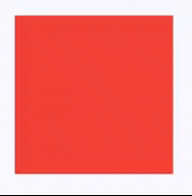
Handling hovers#
import flet as ft


def main(page: ft.Page):
    def handle_hover(e: ft.Event[ft.Container]):
        e.control.bgcolor = ft.Colors.BLUE if e.data else ft.Colors.RED
        e.control.update()

    page.add(
        ft.Container(
            width=200,
            height=200,
            bgcolor=ft.Colors.RED,
            ink=False,
            on_hover=handle_hover,
        )
    )


ft.run(main)
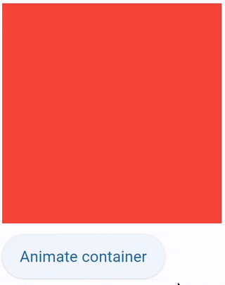
Animate 1#
import flet as ft


def main(page: ft.Page):
    def animate_container(e: ft.Event[ft.Button]):
        container.width = 100 if container.width == 150 else 150
        container.height = 50 if container.height == 150 else 150
        container.bgcolor = (
            ft.Colors.BLUE if container.bgcolor == ft.Colors.RED else ft.Colors.RED
        )
        container.update()

    page.add(
        container := ft.Container(
            width=150,
            height=150,
            bgcolor=ft.Colors.RED,
            animate=ft.Animation(duration=1000, curve=ft.AnimationCurve.BOUNCE_OUT),
        ),
        ft.Button("Animate container", on_click=animate_container),
    )


ft.run(main)
Animate 2#
import flet as ft


def main(page: ft.Page):
    gradient1 = ft.LinearGradient(
        begin=ft.Alignment.TOP_CENTER,
        end=ft.Alignment.BOTTOM_CENTER,
        colors=[ft.Colors.GREEN, ft.Colors.BLUE],
        stops=[0.5, 1.0],
    )
    gradient2 = ft.RadialGradient(
        center=ft.Alignment.TOP_LEFT,
        radius=1.0,
        colors=[ft.Colors.YELLOW, ft.Colors.DEEP_ORANGE_900],
        tile_mode=ft.GradientTileMode.CLAMP,
    )

    message = ft.Text("Animate me!")

    def animate_container(e: ft.Event[ft.Button]):
        message.value = (
            "Animate me back!" if message.value == "Animate me!" else "Animate me!"
        )
        container.width = 150 if container.width == 250 else 250
        container.height = 150 if container.height == 250 else 250
        container.gradient = gradient2 if container.gradient == gradient1 else gradient1
        if container.alignment == ft.Alignment.TOP_LEFT:
            container.alignment = ft.Alignment.BOTTOM_RIGHT
        else:
            container.alignment = ft.Alignment.TOP_LEFT
        container.border_radius = 30 if container.border_radius == 10 else 10
        container.border = (
            ft.Border.all(width=2, color=ft.Colors.BLACK)
            if container.border == ft.Border.all(width=2, color=ft.Colors.BLUE)
            else ft.Border.all(width=2, color=ft.Colors.BLUE)
        )
        container.update()

    page.add(
        container := ft.Container(
            content=message,
            width=250,
            height=250,
            gradient=gradient2,
            alignment=ft.Alignment.TOP_LEFT,
            animate=ft.Animation(duration=1000, curve=ft.AnimationCurve.BOUNCE_OUT),
            border=ft.Border.all(width=2, color=ft.Colors.BLUE),
            border_radius=10,
            padding=10,
        ),
        ft.Button("Animate container", on_click=animate_container),
    )


ft.run(main)
Animate 3#
import flet as ft


def main(page: ft.Page):
    def animate(e: ft.Event[ft.Button]):
        container.width = 100 if container.width == 150 else 150
        container.height = 50 if container.height == 150 else 150
        container.bgcolor = (
            ft.Colors.BLUE if container.bgcolor == ft.Colors.RED else ft.Colors.RED
        )
        container.update()

    page.add(
        container := ft.Container(
            width=150,
            height=150,
            bgcolor=ft.Colors.RED,
            animate=ft.Animation(1000, ft.AnimationCurve.BOUNCE_OUT),
        ),
        ft.Button("Animate container", on_click=animate),
    )


ft.run(main)
Animate 4#
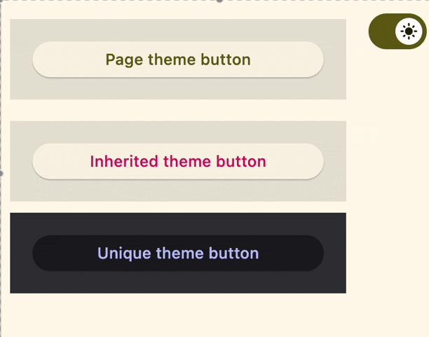
Nested themes 1#
import flet as ft


def main(page: ft.Page):
    # Yellow page theme with SYSTEM (default) mode
    page.theme = ft.Theme(
        color_scheme_seed=ft.Colors.YELLOW,
    )

    page.add(
        # Page theme
        ft.Container(
            content=ft.Button("Page theme button"),
            bgcolor=ft.Colors.SURFACE_TINT,
            padding=20,
            width=300,
        ),
        # Inherited theme with primary color overridden
        ft.Container(
            theme=ft.Theme(color_scheme=ft.ColorScheme(primary=ft.Colors.PINK)),
            content=ft.Button("Inherited theme button"),
            bgcolor=ft.Colors.SURFACE_TINT,
            padding=20,
            width=300,
        ),
        # Unique always DARK theme
        ft.Container(
            theme=ft.Theme(color_scheme_seed=ft.Colors.INDIGO),
            theme_mode=ft.ThemeMode.DARK,
            content=ft.Button("Unique theme button"),
            bgcolor=ft.Colors.SURFACE_TINT,
            padding=20,
            width=300,
        ),
    )


ft.run(main)
Nested themes 2#
import flet as ft


def main(page: ft.Page):
    # page.theme = ft.Theme(
    #     color_scheme_seed=ft.Colors.YELLOW,
    #     color_scheme=ft.ColorScheme(
    #         primary=ft.Colors.GREEN, primary_container=ft.Colors.GREEN_200
    #     ),
    # )

    page.add(
        ft.Row(
            controls=[
                ft.Button("Page theme"),
                ft.TextButton("Page theme text button"),
                ft.Text(
                    "Text in primary container color",
                    color=ft.Colors.PRIMARY_CONTAINER,
                ),
            ]
        ),
        ft.Container(
            height=100,
            theme=ft.Theme(color_scheme=ft.ColorScheme(primary=ft.Colors.PINK)),
            content=ft.Row(
                controls=[
                    ft.Button("Inherited theme with primary color overriden"),
                    ft.TextButton("Button 2"),
                ]
            ),
        ),
        ft.Container(
            padding=20,
            bgcolor=ft.Colors.SURFACE_TINT,
            theme_mode=ft.ThemeMode.DARK,
            theme=ft.Theme(
                color_scheme_seed=ft.Colors.GREEN,
                color_scheme=ft.ColorScheme(primary_container=ft.Colors.BLUE),
            ),
            content=ft.Row(
                controls=[
                    ft.Button("Always DARK theme"),
                    ft.TextButton("Text button"),
                    ft.Text(
                        "Text in primary container color",
                        color=ft.Colors.PRIMARY_CONTAINER,
                    ),
                ]
            ),
        ),
        ft.Container(
            padding=20,
            bgcolor=ft.Colors.SURFACE_TINT,
            border=ft.border.all(3, ft.Colors.OUTLINE),
            theme_mode=ft.ThemeMode.LIGHT,
            theme=ft.Theme(),
            content=ft.Row(
                controls=[
                    ft.Button("Always LIGHT theme"),
                    ft.TextButton("Text button"),
                    ft.Text(
                        "Text in primary container color",
                        color=ft.Colors.PRIMARY_CONTAINER,
                    ),
                ]
            ),
        ),
        ft.Container(
            padding=20,
            bgcolor=ft.Colors.SURFACE_TINT,
            border=ft.border.all(3, ft.Colors.OUTLINE),
            border_radius=10,
            theme_mode=ft.ThemeMode.SYSTEM,
            theme=ft.Theme(),
            content=ft.Row(
                controls=[
                    ft.Button("SYSTEM theme"),
                    ft.TextButton("Text button"),
                    ft.Text(
                        "Text in primary container color",
                        color=ft.Colors.PRIMARY_CONTAINER,
                    ),
                ]
            ),
        ),
    )


ft.run(main)
Nested themes 3#
import flet as ft


def main(page: ft.Page):
    page.theme_mode = ft.ThemeMode.DARK

    def handle_switch_change(e: ft.Event[ft.Switch]):
        if page.theme_mode == ft.ThemeMode.DARK:
            page.theme_mode = ft.ThemeMode.LIGHT
            switch.thumb_icon = ft.Icons.LIGHT_MODE
        else:
            switch.thumb_icon = ft.Icons.DARK_MODE
            page.theme_mode = ft.ThemeMode.DARK
        page.update()

    # Yellow page theme with SYSTEM (default) mode
    page.theme = ft.Theme(color_scheme_seed=ft.Colors.YELLOW)

    switch = ft.Switch(thumb_icon=ft.Icons.DARK_MODE, on_change=handle_switch_change)

    page.add(
        # Page theme
        ft.Row(
            alignment=ft.MainAxisAlignment.SPACE_BETWEEN,
            controls=[
                ft.Container(
                    content=ft.Button("Page theme button"),
                    bgcolor=ft.Colors.SURFACE_TINT,
                    padding=20,
                    width=300,
                ),
                ft.Container(
                    content=switch,
                    padding=ft.Padding.only(bottom=50),
                    alignment=ft.Alignment.TOP_RIGHT,
                ),
            ],
        ),
        # Inherited theme with primary color overridden
        ft.Container(
            theme=ft.Theme(color_scheme=ft.ColorScheme(primary=ft.Colors.PINK)),
            content=ft.Button("Inherited theme button"),
            bgcolor=ft.Colors.SURFACE_TINT,
            padding=20,
            width=300,
        ),
        # Unique always DARK theme
        ft.Container(
            theme=ft.Theme(color_scheme_seed=ft.Colors.INDIGO),
            theme_mode=ft.ThemeMode.DARK,
            content=ft.Button("Unique theme button"),
            bgcolor=ft.Colors.SURFACE_TINT,
            padding=20,
            width=300,
        ),
    )


ft.run(main)
Size aware#
import flet as ft
import flet.canvas as cv


class SizeAwareContainer(cv.Canvas):
    def __init__(self, color, expand):
        super().__init__(expand=expand)
        self.size = ft.Text()
        self.content = ft.Container(
            content=self.size,
            alignment=ft.Alignment.CENTER,
            bgcolor=color,
        )
        self.resize_interval = 100
        self.on_resize = self.canvas_resize

    def canvas_resize(self, e):
        self.size.value = f"{int(e.width)} x {int(e.height)}"
        self.update()


def main(page: ft.Page):
    page.add(
        ft.Row(
            expand=2,
            controls=[
                SizeAwareContainer(ft.Colors.RED, expand=2),
                SizeAwareContainer(ft.Colors.GREEN, expand=4),
            ],
        ),
        ft.Row(
            expand=3,
            controls=[
                SizeAwareContainer(ft.Colors.YELLOW, expand=2),
                SizeAwareContainer(ft.Colors.BLUE, expand=4),
            ],
        ),
    )


ft.run(main)
Bases: LayoutControl, AdaptiveControl
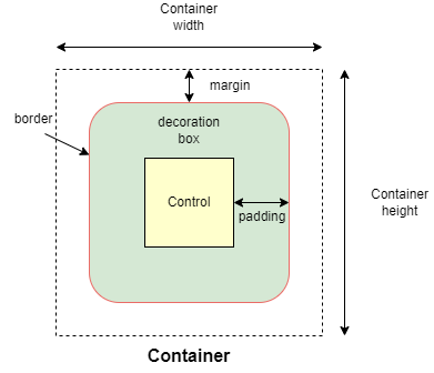
Allows to decorate a control with background color and border and position it with padding, margin and alignment.
adaptive: bool | None = None
Enables platform-specific rendering or inheritance of adaptiveness from parent controls.
alignment: Alignment | None = None
Defines the alignment of the content inside the container.
animate: AnimationValue | None = None
Enables container "implicit" animation that gradually changes its values over a period of time.
animate_align: AnimationValue | None = None
Enables implicit animation of the [align][flet.LayoutControl.] property.
More information here.
animate_margin: AnimationValue | None = None
Enables implicit animation of the [margin][flet.LayoutControl.] property.
More information here.
animate_offset: AnimationValue | None = None
Enables implicit animation of the [offset][flet.LayoutControl.] property.
More information here.
animate_opacity: AnimationValue | None = None
Enables implicit animation of the [opacity][flet.LayoutControl.] property.
More information here.
animate_position: AnimationValue | None = None
Enables implicit animation of the positioning properties
([left][flet.LayoutControl.], [right][flet.LayoutControl.],
[top][flet.LayoutControl.] and [bottom][flet.LayoutControl.]).
More information here.
animate_rotation: AnimationValue | None = None
Enables implicit animation of the [rotate][flet.LayoutControl.] property.
More information here.
animate_scale: AnimationValue | None = None
Enables implicit animation of the [scale][flet.LayoutControl.] property.
More information here.
aspect_ratio: Number | None = None
The aspect ratio of the control. It is defined as the ratio of the width to the height.
blend_mode: BlendMode | None = None
The blend mode applied to the color or gradient background of the container.
Defaults to BlendMode.MODULATE.
blur: BlurValue | None = None
Defines how Gaussian blur effect should be applied under this container.
Example
ft.Stack(
    controls=[
        ft.Container(
            content=ft.Text("Hello"),
            image_src="https://picsum.photos/100/100",
            width=100,
            height=100,
        ),
        ft.Container(
            width=50,
            height=50,
            blur=10,
            bgcolor="#44CCCC00",
        ),
        ft.Container(
            width=50,
            height=50,
            left=10,
            top=60,
            blur=(0, 10),
        ),
        ft.Container(
            top=10,
            left=60,
            blur=ft.Blur(10, 0, ft.BlurTileMode.MIRROR),
            width=50,
            height=50,
            bgcolor="#44CCCCCC",
            border=ft.border.all(2, ft.Colors.BLACK),
        ),
    ]
)
bottom: Number | None = None
The distance that the child's bottom edge is inset from the bottom of the stack.
Note
Effective only if this control is a descendant of one of the following:
[Stack][flet.] control, [Page.overlay][flet.] list.
clip_behavior: ClipBehavior | None = None
Defines how the content of this container is clipped.
Defaults to ClipBehavior.ANTI_ALIAS if border_radius is not None;
otherwise ClipBehavior.NONE.
col: ResponsiveNumber = 12
If a parent of this control is a [ResponsiveRow][flet.],
this property is used to determine
how many virtual columns of a screen this control will span.
Can be a number or a dictionary configured to have a different value for specific
breakpoints, for example col={"sm": 6}.
This control spans the 12 virtual columns by default.
Dimensions
| Breakpoint | Dimension |
|---|---|
| xs | <576px |
| sm | ≥576px |
| md | ≥768px |
| lg | ≥992px |
| xl | ≥1200px |
| xxl | ≥1400px |
dark_theme: Theme | None = None
Allows setting a nested theme to be used when in dark theme mode for all controls inside the container and down its tree.
disabled: bool = False
Every control has disabled property which is False by default - control and all
its children are enabled.
Note
The value of this property will be propagated down to all children controls recursively.
Specifies whether/how this control should expand to fill available space in its parent layout.
More information here.
Note
Has effect only if the direct parent of this control is one of the following
controls, or their subclasses: [Column][flet.], [Row][flet.],
[View][flet.], [Page][flet.].
expand_loose: bool = False
Allows the control to expand along the main axis if space is available, but does not require it to fill all available space.
More information here.
Note
If expand_loose is True, it will have effect only if:
expandis notNoneand- the direct parent of this control is one of the following controls, or their
subclasses: [
Column][flet.], [Row][flet.], [View][flet.], [Page][flet.].
foreground_decoration: BoxDecoration | None = None
The foreground decoration of this container.
ignore_interactions: bool = False
Whether to ignore all interactions with this container and its descendants.
image: DecorationImage | None = None
An image to paint above the bgcolor or gradient. If shape=BoxShape.CIRCLE
then this image is clipped to the circle's boundary; if border_radius is not
None then the image is clipped to the given radii.
left: Number | None = None
The distance that the child's left edge is inset from the left of the stack.
Note
Effective only if this control is a descendant of one of the following:
[Stack][flet.] control, [Page.overlay][flet.] list.
offset: OffsetValue | None = None
Applies a translation transformation before painting the control.
The translation is expressed as an Offset scaled to the control's size.
So, Offset(x=0.25, y=0), for example, will result in a horizontal translation
of one quarter the width of this control.
Example
The following example displays container at 0, 0 top left corner of a stack as
transform applies -1 * 100, -1 * 100 (offset * control's size) horizontal and
vertical translations to the control:
on_animation_end: (
    ControlEventHandler[LayoutControl] | None
) = None
Called when animation completes.
Can be used to chain multiple animations.
The data property of the event handler argument contains the name
of the animation.
More information here.
on_click: ControlEventHandler[Container] | None = None
Called when a user clicks the container.
It will not be called if this container is long pressed.
on_hover: ControlEventHandler[Container] | None = None
Called when a mouse pointer enters or exists the container area.
The data property of the event handler argument is a boolean:
True when the cursor enters and False when it exits this container.
on_long_press: ControlEventHandler[Container] | None = None
Called when this container is long-pressed.
opacity: Number = 1.0
Defines the transparency of the control.
Value ranges from 0.0 (completely transparent) to 1.0 (completely opaque
without any transparency).
padding: PaddingValue | None = None
Empty space to inscribe inside a container decoration (background, border). The child control is placed inside this padding.
parent: BaseControl | None
The direct ancestor(parent) of this control.
It defaults to None and will only have a value when this control is mounted
(added to the page tree).
The Page control (which is the root of the tree) is an exception - it always
has parent=None.
right: Number | None = None
The distance that the child's right edge is inset from the right of the stack.
Note
Effective only if this control is a descendant of one of the following:
[Stack][flet.] control, [Page.overlay][flet.] list.
rotate: RotateValue | None = None
Transforms this control using a rotation around its center.
The value of rotate property could be one of the following types:
number- a rotation in clockwise radians. Full circle360°ismath.pi * 2radians,90°ispi / 2,45°ispi / 4, etc.Rotate- allows to specify rotationangleas well asalignment- the location of rotation center.
scale: ScaleValue | None = None
Scales this control along the 2D plane. Default scale factor is 1.0,
meaning no-scale.
Setting this property to 0.5, for example, makes this control twice smaller,
while 2.0 makes it twice larger.
Different scale multipliers can be specified for x and y axis, by setting
Control.scale property to an instance of Scale class.
Either scale or scale_x and scale_y could be specified, but not all of them.
theme: Theme | None = None
Allows setting a nested theme for all controls inside this container and down its tree.
theme_mode: ThemeMode | None = None
"Resets" parent theme and creates a new, unique scheme for all
controls inside the container. Otherwise the styles defined in container's
theme property override corresponding styles from
the parent, inherited theme.
Defaults to ThemeMode.SYSTEM.
tooltip: TooltipValue | None = None
The tooltip ot show when this control is hovered over.
top: Number | None = None
The distance that the child's top edge is inset from the top of the stack.
Note
Effective only if this control is a descendant of one of the following:
[Stack][flet.] control, [Page.overlay][flet.] list.
The URL to open when this container is clicked.
Additionally, if an on_click callback is provided,
it is fired after that.
visible: bool = True
Every control has visible property which is True by default - control is
rendered on the page. Setting visible to False completely prevents control (and
all its children if any) from rendering on a page canvas. Hidden controls cannot be
focused or selected with a keyboard or mouse and they do not emit any events.
Called once during control initialization to define its child controls. self.page is available in this method.