CupertinoAppBar
Examples#
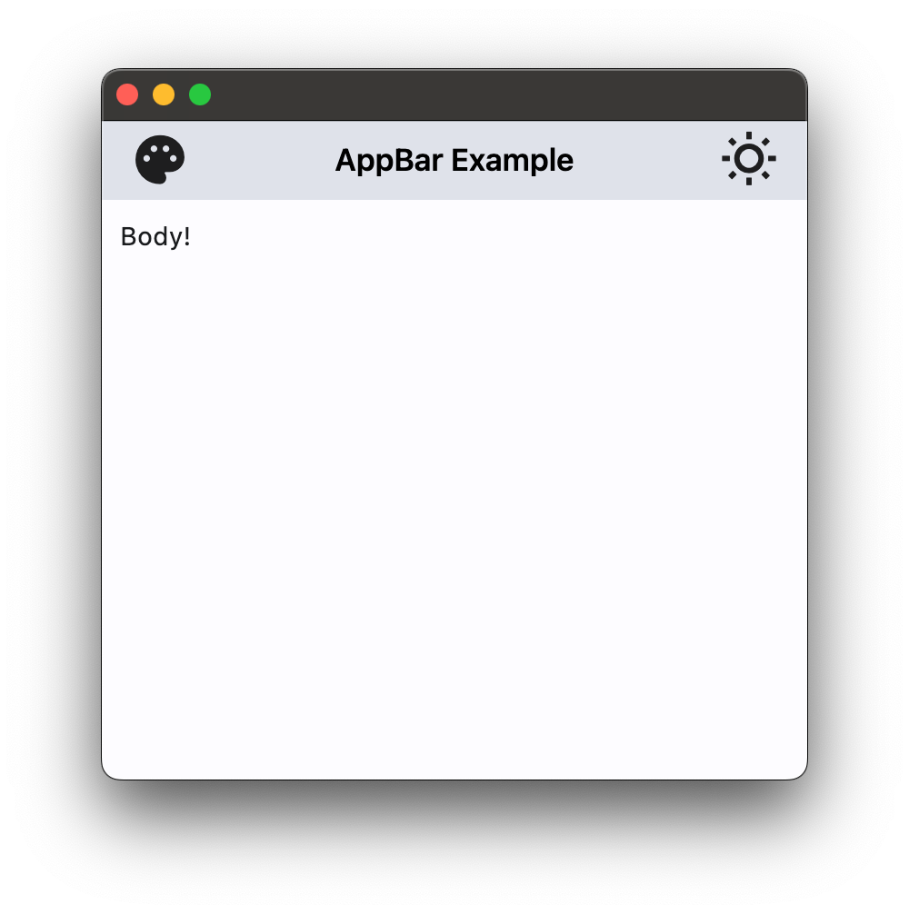
Basic Example#
import flet as ft


def main(page: ft.Page):
    page.theme_mode = ft.ThemeMode.LIGHT

    page.appbar = ft.CupertinoAppBar(
        leading=ft.Icon(ft.Icons.PALETTE, color=ft.Colors.ON_SECONDARY),
        title=ft.Text("CupertinoAppBar Example"),
        trailing=ft.Icon(ft.Icons.WB_SUNNY_OUTLINED, color=ft.Colors.ON_SECONDARY),
        automatic_background_visibility=False,
        bgcolor=ft.Colors.SECONDARY,
        brightness=ft.Brightness.LIGHT,
    )

    page.add(ft.Text("Body!"))


ft.run(main)
App bar with theme mode toggle#
import flet as ft


def main(page: ft.Page):
    page.theme_mode = ft.ThemeMode.LIGHT

    def handle_theme_mode_toggle(e: ft.Event[ft.IconButton]):
        page.theme_mode = (
            ft.ThemeMode.DARK
            if page.theme_mode == ft.ThemeMode.LIGHT
            else ft.ThemeMode.LIGHT
        )
        theme_mode_button.icon = (
            ft.Icons.WB_SUNNY_OUTLINED
            if page.theme_mode == ft.ThemeMode.LIGHT
            else ft.Icons.WB_SUNNY
        )
        page.update()

    theme_mode_button = ft.IconButton(
        icon=(
            ft.Icons.WB_SUNNY_OUTLINED
            if page.theme_mode == ft.ThemeMode.LIGHT
            else ft.Icons.WB_SUNNY
        ),
        icon_color=ft.Colors.ON_INVERSE_SURFACE,
        on_click=handle_theme_mode_toggle,
    )

    page.appbar = ft.CupertinoAppBar(
        automatic_background_visibility=False,
        leading=ft.Icon(ft.Icons.PALETTE, color=ft.Colors.ON_INVERSE_SURFACE),
        bgcolor=ft.Colors.INVERSE_SURFACE,
        trailing=theme_mode_button,
        title=ft.Text("CupertinoAppBar Example", color=ft.Colors.ON_INVERSE_SURFACE),
    )

    page.add(ft.Text("Body!"))


ft.run(main)
Bases: Control
An iOS-styled app bar.
Note
The alignment of the title depends on whether
this app bar is large or not.
If it is True, the title is left-aligned and if it
is False (the default), the title is centered.
automatic_background_visibility: bool | None = None
Whether the navigation bar should appear transparent when content is scrolled under it.
If False, the navigation bar will display its bgcolor.
automatically_imply_title: bool | None = None
Whether we should try to imply the title control if None.
- If True and
titleisNone, aTextcontrol containing the current route's title will be automatically filled in. - If the
titleis notNone, this parameter has no effect.
bgcolor: ColorValue | None = None
The fill color to use for this app bar.
Default color is defined by current theme.
border: Border | None = None
The border of the app bar. By default, a single pixel bottom border side is rendered.
brightness: Brightness | None = None
col: ResponsiveNumber = 12
If a parent of this control is a [ResponsiveRow][flet.],
this property is used to determine
how many virtual columns of a screen this control will span.
Can be a number or a dictionary configured to have a different value for specific
breakpoints, for example col={"sm": 6}.
This control spans the 12 virtual columns by default.
Dimensions
| Breakpoint | Dimension |
|---|---|
| xs | <576px |
| sm | ≥576px |
| md | ≥768px |
| lg | ≥992px |
| xl | ≥1200px |
| xxl | ≥1400px |
disabled: bool = False
Every control has disabled property which is False by default - control and all
its children are enabled.
Note
The value of this property will be propagated down to all children controls recursively.
enable_background_filter_blur: bool | None = None
Whether to have a blur effect when a non-opaque bgcolor is used.
This will only be respected when automatic_background_visibility
is False or until content scrolls under the navigation bar.
Specifies whether/how this control should expand to fill available space in its parent layout.
More information here.
Note
Has effect only if the direct parent of this control is one of the following
controls, or their subclasses: [Column][flet.], [Row][flet.],
[View][flet.], [Page][flet.].
expand_loose: bool = False
Allows the control to expand along the main axis if space is available, but does not require it to fill all available space.
More information here.
Note
If expand_loose is True, it will have effect only if:
expandis notNoneand- the direct parent of this control is one of the following controls, or their
subclasses: [
Column][flet.], [Row][flet.], [View][flet.], [Page][flet.].
leading: Control | None = None
A control to display at the start of this app bar.
Typically the leading control is an Icon or an IconButton .
If it is None and automatically_imply_leading is True,
an appropriate button will be automatically created.
opacity: Number = 1.0
Defines the transparency of the control.
Value ranges from 0.0 (completely transparent) to 1.0 (completely opaque
without any transparency).
padding: PaddingValue | None = None
Defines the padding for the contents of the app bar.
If None, the app bar will adopt the following defaults:
- vertically, contents will be sized to the same height as the app bar itself minus the status bar.
- horizontally, padding will be
16pixels according to iOS specifications unless the leading widget is an automatically inserted back button, in which case the padding will be0.
Note
Vertical padding (top and bottom) won't change the height of this app bar.
parent: BaseControl | None
The direct ancestor(parent) of this control.
It defaults to None and will only have a value when this control is mounted
(added to the page tree).
The Page control (which is the root of the tree) is an exception - it always
has parent=None.
previous_page_title: str | None = None
Manually specify the previous route's title when automatically implying the leading back button.
Overrides the text shown with the back chevron instead of automatically showing the
previous route's title when automatically_imply_leading is True.
Note
Has no effect if leading is not None or if
automatically_imply_leading is False.
title: StrOrControl | None = None
A string or a control to display in the middle of this app bar.
Typically a Text.
tooltip: TooltipValue | None = None
The tooltip ot show when this control is hovered over.
trailing: Control | None = None
A Control to place at the end of the app bar.
Typically used for actions such as searching or editing.
transition_between_routes: bool = True
Determines whether the app bar transitions between routes.
If True, this app bar will animate on top of route transitions when the
destination route also contains a CupertinoAppBar or CupertinoSliverAppBar with
transition_between_routes set to True.
This transition also occurs during edge back swipe gestures, mimicking native iOS behavior.
Note
When enabled, only one app bar can be present per route unless a
hero_tag is specified.
visible: bool = True
Every control has visible property which is True by default - control is
rendered on the page. Setting visible to False completely prevents control (and
all its children if any) from rendering on a page canvas. Hidden controls cannot be
focused or selected with a keyboard or mouse and they do not emit any events.
Called once during control initialization to define its child controls. self.page is available in this method.