DatePicker
Examples#
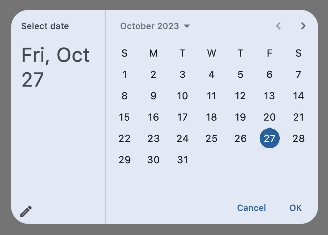
Basic Example#
import datetime

import flet as ft


def main(page: ft.Page):
    page.horizontal_alignment = ft.CrossAxisAlignment.CENTER

    def handle_change(e: ft.Event[ft.DatePicker]):
        page.add(ft.Text(f"Date changed: {e.control.value.strftime('%m/%d/%Y')}"))

    def handle_dismissal(e: ft.Event[ft.DatePicker]):
        page.add(ft.Text("DatePicker dismissed"))

    page.add(
        ft.Button(
            content="Pick date",
            icon=ft.Icons.CALENDAR_MONTH,
            on_click=lambda e: page.show_dialog(
                ft.DatePicker(
                    first_date=datetime.datetime(year=2000, month=10, day=1),
                    last_date=datetime.datetime(year=2025, month=10, day=1),
                    on_change=handle_change,
                    on_dismiss=handle_dismissal,
                )
            ),
        )
    )


ft.run(main)
Bases: DialogControl
A Material-style date picker dialog.
It is added to Page.overlay and can be opened by
calling Page.show_dialog() method.
Depending on the date_picker_entry_mode, it will show either a Calendar
or an Input (TextField) for picking a date.
adaptive: bool | None = None
Enables platform-specific rendering or inheritance of adaptiveness from parent controls.
barrier_color: ColorValue | None = None
The color of the modal barrier that darkens everything below the date picker.
If None, the DialogTheme.barrier_color
is used.
If it is also None, then Colors.BLACK_54 is used.
cancel_text: str | None = None
The text that is displayed on the cancel button. Defaults to "Cancel".
col: ResponsiveNumber = 12
If a parent of this control is a [ResponsiveRow][flet.],
this property is used to determine
how many virtual columns of a screen this control will span.
Can be a number or a dictionary configured to have a different value for specific
breakpoints, for example col={"sm": 6}.
This control spans the 12 virtual columns by default.
Dimensions
| Breakpoint | Dimension |
|---|---|
| xs | <576px |
| sm | ≥576px |
| md | ≥768px |
| lg | ≥992px |
| xl | ≥1200px |
| xxl | ≥1400px |
confirm_text: str | None = None
The text that is displayed on the confirm button. Defaults to "OK".
current_date: DateTimeValue = field(
    default_factory=lambda: now()
)
The date representing today. It will be highlighted in the day grid.
date_picker_entry_mode: DatePickerEntryMode = CALENDAR
The initial mode of date entry method for the date picker dialog.
date_picker_mode: DatePickerMode = DAY
Initial display of a calendar date picker.
disabled: bool = False
Every control has disabled property which is False by default - control and all
its children are enabled.
Note
The value of this property will be propagated down to all children controls recursively.
error_format_text: str | None = None
The error message displayed below the TextField if the entered date is not in the correct format.
Defaults to "Invalid format".
error_invalid_text: str | None = None
The error message displayed below the TextField if the date is earlier than
first_date or later than last_date.
Defaults to "Out of range".
Specifies whether/how this control should expand to fill available space in its parent layout.
More information here.
Note
Has effect only if the direct parent of this control is one of the following
controls, or their subclasses: [Column][flet.], [Row][flet.],
[View][flet.], [Page][flet.].
expand_loose: bool = False
Allows the control to expand along the main axis if space is available, but does not require it to fill all available space.
More information here.
Note
If expand_loose is True, it will have effect only if:
expandis notNoneand- the direct parent of this control is one of the following controls, or their
subclasses: [
Column][flet.], [Row][flet.], [View][flet.], [Page][flet.].
field_hint_text: str | None = None
The hint text displayed in the text field.
The default value is the date format string that depends on your locale. For example, 'mm/dd/yyyy' for en_US.
field_label_text: str | None = None
The label text displayed in the TextField.
Defaults to "Enter Date".
first_date: DateTimeValue = field(
    default_factory=lambda: datetime(
        year=1900, month=1, day=1
    )
)
The earliest allowable date that the user can select. Defaults to January 1, 1900.
help_text: str | None = None
The text that is displayed at the top of the header.
This is used to indicate to the user what they are selecting a date for.
Defaults to "Select date".
keyboard_type: KeyboardType = DATETIME
The type of keyboard to use for editing the text.
last_date: DateTimeValue = field(
    default_factory=lambda: datetime(
        year=2050, month=1, day=1
    )
)
The latest allowable date that the user can select. Defaults to January 1, 2050.
modal: bool = False
Whether this date picker cannot be dismissed by clicking the area outside of it.
on_change: ControlEventHandler[DatePicker] | None = None
Called when user clicks confirm button.
value is updated with selected date.
The data property of the event handler argument contains the selected date.
on_dismiss: ControlEventHandler[DialogControl] | None = None
Called when dialog is dismissed.
on_entry_mode_change: (
    EventHandler[DatePickerEntryModeChangeEvent] | None
) = None
Called when the date_picker_entry_mode
is changed.
opacity: Number = 1.0
Defines the transparency of the control.
Value ranges from 0.0 (completely transparent) to 1.0 (completely opaque
without any transparency).
parent: BaseControl | None
The direct ancestor(parent) of this control.
It defaults to None and will only have a value when this control is mounted
(added to the page tree).
The Page control (which is the root of the tree) is an exception - it always
has parent=None.
switch_to_calendar_icon: IconData | None = None
The name of the icon displayed in the corner of the dialog when
date_picker_entry_mode
is DatePickerEntryMode.INPUT.
Clicking on this icon changes the date_picker_entry_mode to
DatePickerEntryMode.CALENDAR.
If None, Icons.CALENDAR_TODAY is used.
switch_to_input_icon: IconData | None = None
The name of the icon displayed in the corner of the dialog when
date_picker_entry_mode
is DatePickerEntryMode.CALENDAR.
Clicking on icon changes the DatePickerEntryMode to
DatePickerEntryMode.INPUT.
If None, Icons.EDIT_OUTLINED is used.
tooltip: TooltipValue | None = None
The tooltip ot show when this control is hovered over.
value: DateTimeValue | None = None
The selected date that the picker should display.
Defaults to current_date.
visible: bool = True
Every control has visible property which is True by default - control is
rendered on the page. Setting visible to False completely prevents control (and
all its children if any) from rendering on a page canvas. Hidden controls cannot be
focused or selected with a keyboard or mouse and they do not emit any events.
Called once during control initialization to define its child controls. self.page is available in this method.