Dismissible
Examples#
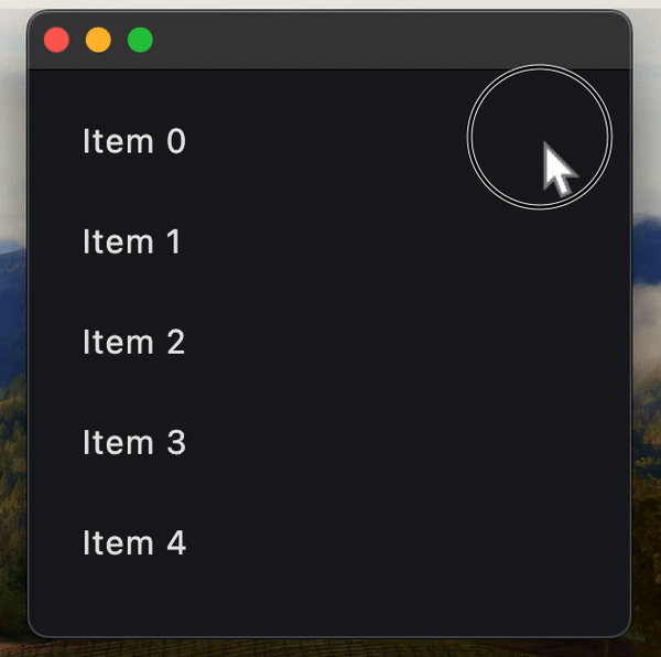
Dismissable ListTiles#
import flet as ft


def main(page: ft.Page):
    async def handle_dialog_action_click(e: ft.Event[ft.TextButton]):
        page.pop_dialog()
        await dlg.data.confirm_dismiss(e.control.data)

    dlg = ft.AlertDialog(
        modal=True,
        title=ft.Text("Please confirm"),
        content=ft.Text("Do you really want to delete this item?"),
        actions=[
            ft.TextButton("Yes", data=True, on_click=handle_dialog_action_click),
            ft.TextButton("No", data=False, on_click=handle_dialog_action_click),
        ],
        actions_alignment=ft.MainAxisAlignment.CENTER,
    )

    async def handle_confirm_dismiss(e: ft.DismissibleDismissEvent):
        if e.direction == ft.DismissDirection.END_TO_START:  # right-to-left slide
            # save current dismissible to dialog's data, for confirmation in
            # handle_dialog_action_click
            dlg.data = e.control
            page.show_dialog(dlg)
        else:  # left-to-right slide
            await e.control.confirm_dismiss(True)

    def handle_dismiss(e):
        e.control.parent.controls.remove(e.control)
        page.update()

    def handle_update(e: ft.DismissibleUpdateEvent):
        print(e)

    page.add(
        ft.ListView(
            expand=True,
            controls=[
                ft.Dismissible(
                    content=ft.ListTile(title=ft.Text(f"Item {i}")),
                    dismiss_direction=ft.DismissDirection.HORIZONTAL,
                    background=ft.Container(bgcolor=ft.Colors.GREEN),
                    secondary_background=ft.Container(bgcolor=ft.Colors.RED),
                    on_dismiss=handle_dismiss,
                    on_update=handle_update,
                    on_confirm_dismiss=handle_confirm_dismiss,
                    dismiss_thresholds={
                        ft.DismissDirection.END_TO_START: 0.2,
                        ft.DismissDirection.START_TO_END: 0.2,
                    },
                )
                for i in range(10)
            ],
        )
    )


ft.run(main)
Bases: LayoutControl, AdaptiveControl
A control that can be dismissed by dragging in the indicated
dismiss_direction.
When dragged or flung in the specified dismiss_direction,
its content smoothly slides out of view.
After completing the sliding animation, if a resize_duration is provided,
this control further animates its height (or width, depending on what is
perpendicular to the dismiss_direction), gradually reducing it to zero
over the specified resize_duration.
| RAISES | DESCRIPTION |
|---|---|
AssertionError
|
If the |
AssertionError
|
If the |
adaptive: bool | None = None
Enables platform-specific rendering or inheritance of adaptiveness from parent controls.
animate_align: AnimationValue | None = None
Enables implicit animation of the [align][flet.LayoutControl.] property.
More information here.
animate_margin: AnimationValue | None = None
Enables implicit animation of the [margin][flet.LayoutControl.] property.
More information here.
animate_offset: AnimationValue | None = None
Enables implicit animation of the [offset][flet.LayoutControl.] property.
More information here.
animate_opacity: AnimationValue | None = None
Enables implicit animation of the [opacity][flet.LayoutControl.] property.
More information here.
animate_position: AnimationValue | None = None
Enables implicit animation of the positioning properties
([left][flet.LayoutControl.], [right][flet.LayoutControl.],
[top][flet.LayoutControl.] and [bottom][flet.LayoutControl.]).
More information here.
animate_rotation: AnimationValue | None = None
Enables implicit animation of the [rotate][flet.LayoutControl.] property.
More information here.
animate_scale: AnimationValue | None = None
Enables implicit animation of the [scale][flet.LayoutControl.] property.
More information here.
aspect_ratio: Number | None = None
The aspect ratio of the control. It is defined as the ratio of the width to the height.
background: Control | None = None
A control that is stacked behind the content.
If secondary_background is also
specified, then this control only appears when the content has been dragged
down or to the right.
bottom: Number | None = None
The distance that the child's bottom edge is inset from the bottom of the stack.
Note
Effective only if this control is a descendant of one of the following:
[Stack][flet.] control, [Page.overlay][flet.] list.
col: ResponsiveNumber = 12
If a parent of this control is a [ResponsiveRow][flet.],
this property is used to determine
how many virtual columns of a screen this control will span.
Can be a number or a dictionary configured to have a different value for specific
breakpoints, for example col={"sm": 6}.
This control spans the 12 virtual columns by default.
Dimensions
| Breakpoint | Dimension |
|---|---|
| xs | <576px |
| sm | ≥576px |
| md | ≥768px |
| lg | ≥992px |
| xl | ≥1200px |
| xxl | ≥1400px |
cross_axis_end_offset: Number = 0.0
Specifies the end offset along the main axis once the
content has been dismissed.
If set to a non-zero value, then this dismissible moves in cross direction depending on whether it is positive or negative.
disabled: bool = False
Every control has disabled property which is False by default - control and all
its children are enabled.
Note
The value of this property will be propagated down to all children controls recursively.
dismiss_direction: DismissDirection = HORIZONTAL
The direction in which the control can be dismissed.
dismiss_thresholds: dict[
    DismissDirection, Number | None
] = field(default_factory=dict)
The offset threshold the item has to be dragged in order to be considered
as dismissed. This is specified as a dictionary where the key is of
type DismissDirection and the value is the threshold
(a fractional/decimal value between 0.0 and 1.0, inclusive).
Specifies whether/how this control should expand to fill available space in its parent layout.
More information here.
Note
Has effect only if the direct parent of this control is one of the following
controls, or their subclasses: [Column][flet.], [Row][flet.],
[View][flet.], [Page][flet.].
expand_loose: bool = False
Allows the control to expand along the main axis if space is available, but does not require it to fill all available space.
More information here.
Note
If expand_loose is True, it will have effect only if:
expandis notNoneand- the direct parent of this control is one of the following controls, or their
subclasses: [
Column][flet.], [Row][flet.], [View][flet.], [Page][flet.].
left: Number | None = None
The distance that the child's left edge is inset from the left of the stack.
Note
Effective only if this control is a descendant of one of the following:
[Stack][flet.] control, [Page.overlay][flet.] list.
movement_duration: DurationValue = field(
    default_factory=lambda: Duration(milliseconds=200)
)
The duration for content to dismiss or
to come back to original position if not dismissed.
offset: OffsetValue | None = None
Applies a translation transformation before painting the control.
The translation is expressed as an Offset scaled to the control's size.
So, Offset(x=0.25, y=0), for example, will result in a horizontal translation
of one quarter the width of this control.
Example
The following example displays container at 0, 0 top left corner of a stack as
transform applies -1 * 100, -1 * 100 (offset * control's size) horizontal and
vertical translations to the control:
on_animation_end: (
    ControlEventHandler[LayoutControl] | None
) = None
Called when animation completes.
Can be used to chain multiple animations.
The data property of the event handler argument contains the name
of the animation.
More information here.
on_confirm_dismiss: (
    EventHandler[DismissibleDismissEvent] | None
) = None
Gives the app an opportunity to confirm or veto a pending dismissal. This dismissible cannot be dragged again until this pending dismissal is resolved.
To resolve the pending dismissal, call the
confirm_dismiss() method
passing it a boolean representing the decision. If True, then the control will be
dismissed, otherwise it will be moved back to its original location.
on_dismiss: EventHandler[DismissibleDismissEvent] | None = (
    None
)
Called when this control has been dismissed, after finishing resizing.
on_resize: ControlEventHandler[Dismissible] | None = None
Called when this dismissible changes size, for example, when contracting before being dismissed.
on_update: EventHandler[DismissibleUpdateEvent] | None = (
    None
)
Called when this control has been dragged.
opacity: Number = 1.0
Defines the transparency of the control.
Value ranges from 0.0 (completely transparent) to 1.0 (completely opaque
without any transparency).
parent: BaseControl | None
The direct ancestor(parent) of this control.
It defaults to None and will only have a value when this control is mounted
(added to the page tree).
The Page control (which is the root of the tree) is an exception - it always
has parent=None.
resize_duration: DurationValue = field(
    default_factory=lambda: Duration(milliseconds=300)
)
The amount of time the control will spend contracting
before on_dismiss is called.
right: Number | None = None
The distance that the child's right edge is inset from the right of the stack.
Note
Effective only if this control is a descendant of one of the following:
[Stack][flet.] control, [Page.overlay][flet.] list.
rotate: RotateValue | None = None
Transforms this control using a rotation around its center.
The value of rotate property could be one of the following types:
number- a rotation in clockwise radians. Full circle360°ismath.pi * 2radians,90°ispi / 2,45°ispi / 4, etc.Rotate- allows to specify rotationangleas well asalignment- the location of rotation center.
scale: ScaleValue | None = None
Scales this control along the 2D plane. Default scale factor is 1.0,
meaning no-scale.
Setting this property to 0.5, for example, makes this control twice smaller,
while 2.0 makes it twice larger.
Different scale multipliers can be specified for x and y axis, by setting
Control.scale property to an instance of Scale class.
Either scale or scale_x and scale_y could be specified, but not all of them.
secondary_background: Control | None = None
A control that is stacked behind the content and is
exposed when it has been dragged up or to the left.
Note
Can only be specified if background is also
specified/visible.
tooltip: TooltipValue | None = None
The tooltip ot show when this control is hovered over.
top: Number | None = None
The distance that the child's top edge is inset from the top of the stack.
Note
Effective only if this control is a descendant of one of the following:
[Stack][flet.] control, [Page.overlay][flet.] list.
visible: bool = True
Every control has visible property which is True by default - control is
rendered on the page. Setting visible to False completely prevents control (and
all its children if any) from rendering on a page canvas. Hidden controls cannot be
focused or selected with a keyboard or mouse and they do not emit any events.
Called once during control initialization to define its child controls. self.page is available in this method.