Draggable
Examples#
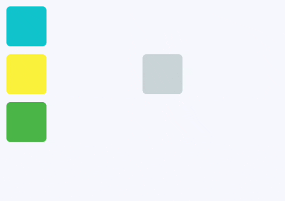
Drag and drop Containers#
import flet as ft


def main(page: ft.Page):
    def handle_drag_will_accept(e: ft.DragWillAcceptEvent):
        e.control.content.border = ft.Border.all(
            2, ft.Colors.BLACK45 if e.accept else ft.Colors.RED
        )
        e.control.update()

    def handle_drag_accept(e: ft.DragTargetEvent):
        src = page.get_control(e.src_id)
        e.control.content.bgcolor = src.content.bgcolor
        e.control.content.border = None
        e.control.update()

    def handle_drag_leave(e: ft.DragTargetLeaveEvent):
        e.control.content.border = None
        e.control.update()

    page.add(
        ft.Row(
            controls=[
                ft.Column(
                    controls=[
                        ft.Draggable(
                            group="color",
                            content=ft.Container(
                                width=50,
                                height=50,
                                bgcolor=ft.Colors.CYAN,
                                border_radius=5,
                            ),
                            content_feedback=ft.Container(
                                width=20,
                                height=20,
                                bgcolor=ft.Colors.CYAN,
                                border_radius=3,
                            ),
                        ),
                        ft.Draggable(
                            group="color",
                            content=ft.Container(
                                width=50,
                                height=50,
                                bgcolor=ft.Colors.YELLOW,
                                border_radius=5,
                            ),
                        ),
                        ft.Draggable(
                            group="color",
                            content=ft.Container(
                                width=50,
                                height=50,
                                bgcolor=ft.Colors.GREEN,
                                border_radius=5,
                            ),
                        ),
                    ]
                ),
                ft.Container(width=100),
                ft.DragTarget(
                    group="color",
                    on_will_accept=handle_drag_will_accept,
                    on_accept=handle_drag_accept,
                    on_leave=handle_drag_leave,
                    content=ft.Container(
                        width=50,
                        height=50,
                        bgcolor=ft.Colors.BLUE_GREY_100,
                        border_radius=5,
                    ),
                ),
            ]
        )
    )


ft.run(main)
Bases: Control
A control that can be dragged from to a DragTarget.
When a draggable control recognizes the start of a drag gesture, it displays the
content_feedback control that tracks the user's finger across the screen.
If the user lifts their finger while on top of a DragTarget, this target is
given the opportunity to complete drag-and-drop flow.
| RAISES | DESCRIPTION |
|---|---|
AssertionError
|
If |
AssertionError
|
If |
affinity: Axis | None = None
Specifies the axis along which this control competes with other gestures to initiate a drag.
- If
None, the drag starts as soon as a tap down gesture is recognized, regardless of direction. - If set to
Axis.HORIZONTALorAxis.VERTICAL, the control will only initiate a drag when the gesture matches the specified axis, allowing it to compete with other gestures in that direction.
axis: Axis | None = None
Restricts the draggable's movement to a specific axis.
Axis.HORIZONTAL: Only allows horizontal dragging.Axis.VERTICAL: Only allows vertical dragging.None: Allows dragging in any direction.
col: ResponsiveNumber = 12
If a parent of this control is a [ResponsiveRow][flet.],
this property is used to determine
how many virtual columns of a screen this control will span.
Can be a number or a dictionary configured to have a different value for specific
breakpoints, for example col={"sm": 6}.
This control spans the 12 virtual columns by default.
Dimensions
| Breakpoint | Dimension |
|---|---|
| xs | <576px |
| sm | ≥576px |
| md | ≥768px |
| lg | ≥992px |
| xl | ≥1200px |
| xxl | ≥1400px |
content: Control
The control to display when the draggable is not being dragged.
If the draggable is being dragged, the
content_when_dragging is displayed instead.
content_feedback: Control | None = None
The control to show under the pointer when a drag is under way.
content_when_dragging: Control | None = None
The control to display instead of content when this draggable
is being dragged.
If set, this control visually replaces content during an active drag operation,
allowing you to show a different appearance or an "empty" placeholder.
If None, the original content remains visible while dragging.
disabled: bool = False
Every control has disabled property which is False by default - control and all
its children are enabled.
Note
The value of this property will be propagated down to all children controls recursively.
Specifies whether/how this control should expand to fill available space in its parent layout.
More information here.
Note
Has effect only if the direct parent of this control is one of the following
controls, or their subclasses: [Column][flet.], [Row][flet.],
[View][flet.], [Page][flet.].
expand_loose: bool = False
Allows the control to expand along the main axis if space is available, but does not require it to fill all available space.
More information here.
Note
If expand_loose is True, it will have effect only if:
expandis notNoneand- the direct parent of this control is one of the following controls, or their
subclasses: [
Column][flet.], [Row][flet.], [View][flet.], [Page][flet.].
group: str = 'default'
The group this draggable belongs to.
Note
For a DragTarget to accept an incoming drop from a Draggable,
they must both be in the same group.
max_simultaneous_drags: int | None = None
Specifies how many simultaneous drag operations are allowed for this draggable.
0- disables dragging entirely.1- allows only one drag at a time. For a better user experience, you may want to provide an "empty" widget forcontent_when_draggingto visually indicate the item is being moved.- Set to any positive integer to allow that many concurrent drags.
- If
None, there is no limit on the number of simultaneous drags.
on_drag_complete: ControlEventHandler[Draggable] | None = (
    None
)
Called when this draggable is dropped and accepted by a DragTarget.
on_drag_start: ControlEventHandler[Draggable] | None = None
Called when this draggable starts being dragged.
opacity: Number = 1.0
Defines the transparency of the control.
Value ranges from 0.0 (completely transparent) to 1.0 (completely opaque
without any transparency).
parent: BaseControl | None
The direct ancestor(parent) of this control.
It defaults to None and will only have a value when this control is mounted
(added to the page tree).
The Page control (which is the root of the tree) is an exception - it always
has parent=None.
tooltip: TooltipValue | None = None
The tooltip ot show when this control is hovered over.
visible: bool = True
Every control has visible property which is True by default - control is
rendered on the page. Setting visible to False completely prevents control (and
all its children if any) from rendering on a page canvas. Hidden controls cannot be
focused or selected with a keyboard or mouse and they do not emit any events.
Called once during control initialization to define its child controls. self.page is available in this method.