ListTile
Examples#
Basic Example#
import flet as ft
def main(page: ft.Page):
page.title = "ListTile Example"
page.add(
ft.Card(
content=ft.Container(
width=500,
padding=ft.Padding.symmetric(vertical=10),
content=ft.Column(
spacing=0,
controls=[
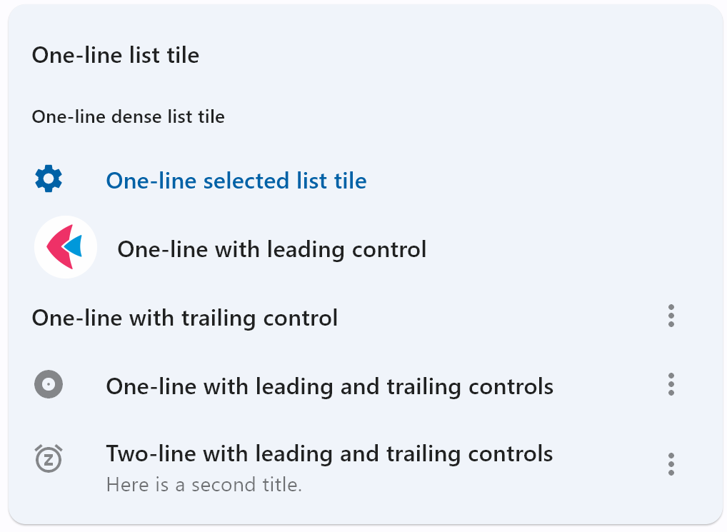
ft.ListTile(title=ft.Text("One-line list tile")),
ft.ListTile(
title=ft.Text("One-line dense list tile"),
dense=True,
),
ft.ListTile(
leading=ft.Icon(ft.Icons.SETTINGS),
title=ft.Text("One-line selected list tile"),
selected=True,
),
ft.ListTile(
leading=ft.Image(
src="/icons/icon-192.png",
fit=ft.BoxFit.CONTAIN,
),
title=ft.Text("One-line with leading control"),
),
ft.ListTile(
title=ft.Text("One-line with trailing control"),
trailing=ft.PopupMenuButton(
icon=ft.Icons.MORE_VERT,
items=[
ft.PopupMenuItem(content="Item 1"),
ft.PopupMenuItem(content="Item 2"),
],
),
),
ft.ListTile(
leading=ft.Icon(ft.Icons.ALBUM),
title=ft.Text(
value="One-line with leading and trailing controls"
),
trailing=ft.PopupMenuButton(
icon=ft.Icons.MORE_VERT,
items=[
ft.PopupMenuItem(content="Item 1"),
ft.PopupMenuItem(content="Item 2"),
],
),
),
ft.ListTile(
leading=ft.Icon(ft.Icons.SNOOZE),
title=ft.Text(
value="Two-line with leading and trailing controls"
),
subtitle=ft.Text("Here is a second title."),
trailing=ft.PopupMenuButton(
icon=ft.Icons.MORE_VERT,
items=[
ft.PopupMenuItem(content="Item 1"),
ft.PopupMenuItem(content="Item 2"),
],
),
),
],
),
)
)
)
ft.run(main)
Bases: LayoutControl, AdaptiveControl
A single fixed-height row that typically contains some text as well as a leading or trailing icon.
adaptive: bool | None = None
Enables platform-specific rendering or inheritance of adaptiveness from parent controls.
animate_align: AnimationValue | None = None
Enables implicit animation of the [align][flet.LayoutControl.] property.
More information here.
animate_margin: AnimationValue | None = None
Enables implicit animation of the [margin][flet.LayoutControl.] property.
More information here.
animate_offset: AnimationValue | None = None
Enables implicit animation of the [offset][flet.LayoutControl.] property.
More information here.
animate_opacity: AnimationValue | None = None
Enables implicit animation of the [opacity][flet.LayoutControl.] property.
More information here.
animate_position: AnimationValue | None = None
Enables implicit animation of the positioning properties
([left][flet.LayoutControl.], [right][flet.LayoutControl.],
[top][flet.LayoutControl.] and [bottom][flet.LayoutControl.]).
More information here.
animate_rotation: AnimationValue | None = None
Enables implicit animation of the [rotate][flet.LayoutControl.] property.
More information here.
animate_scale: AnimationValue | None = None
Enables implicit animation of the [scale][flet.LayoutControl.] property.
More information here.
aspect_ratio: Number | None = None
The aspect ratio of the control. It is defined as the ratio of the width to the height.
autofocus: bool = False
True if the control will be selected as the initial focus. If there is more than
one control on a page with autofocus set, then the first one added to the page will
get focus.
bottom: Number | None = None
The distance that the child's bottom edge is inset from the bottom of the stack.
Note
Effective only if this control is a descendant of one of the following:
[Stack][flet.] control, [Page.overlay][flet.] list.
col: ResponsiveNumber = 12
If a parent of this control is a [ResponsiveRow][flet.],
this property is used to determine
how many virtual columns of a screen this control will span.
Can be a number or a dictionary configured to have a different value for specific
breakpoints, for example col={"sm": 6}.
This control spans the 12 virtual columns by default.
Dimensions
| Breakpoint | Dimension |
|---|---|
| xs | <576px |
| sm | ≥576px |
| md | ≥768px |
| lg | ≥992px |
| xl | ≥1200px |
| xxl | ≥1400px |
content_padding: PaddingValue | None = None
- The tile's internal padding. It insets the contents of this tile.
- its
leading,title,subtitle, andtrailingcontrols.
dense: bool | None = None
Whether this list tile is part of a vertically dense list.
Dense list tiles default to a smaller height.
disabled: bool = False
Every control has disabled property which is False by default - control and all
its children are enabled.
Note
The value of this property will be propagated down to all children controls recursively.
enable_feedback: bool | None = None
Whether detected gestures should provide acoustic and/or haptic feedback.
On Android, for example, setting this to True produce a click sound and a
long-press will produce a short vibration.
Specifies whether/how this control should expand to fill available space in its parent layout.
More information here.
Note
Has effect only if the direct parent of this control is one of the following
controls, or their subclasses: [Column][flet.], [Row][flet.],
[View][flet.], [Page][flet.].
expand_loose: bool = False
Allows the control to expand along the main axis if space is available, but does not require it to fill all available space.
More information here.
Note
If expand_loose is True, it will have effect only if:
expandis notNoneand- the direct parent of this control is one of the following controls, or their
subclasses: [
Column][flet.], [Row][flet.], [View][flet.], [Page][flet.].
hover_color: ColorValue | None = None
The tile's color when hovered. Only shows if toggle_inputs is True.
icon_color: ColorValue | None = None
is_three_line: bool | None = None
Whether this list tile is intended to display three lines of text.
If True, then subtitle must be non-null (since it is expected to give the second
and third lines of text).
If False, the list tile is treated as having one line if the subtitle is null and
treated as having two lines if the subtitle is non-null.
When using a Text control for title and subtitle, you can enforce line limits
using Text.max_lines.
leading_and_trailing_text_style: TextStyle | None = None
The TextStyle for the
leading and trailing controls.
left: Number | None = None
The distance that the child's left edge is inset from the left of the stack.
Note
Effective only if this control is a descendant of one of the following:
[Stack][flet.] control, [Page.overlay][flet.] list.
min_height: Number | None = None
The minimum height allocated for this control.
If None or not set, default tile heights are 56.0, 72.0, and 88.0 for one,
two, and three lines of text respectively.
If dense is True, these
defaults are changed to 48.0, 64.0, and 76.0.
Note that, a visual density value or a large title will also adjust the default tile heights.
min_leading_width: Number | None = None
The minimum width allocated for the leading control.
min_vertical_padding: Number | None = None
The minimum padding on the top and bottom of the title and subtitle controls.
mouse_cursor: MouseCursor | None = None
The cursor to be displayed when a mouse pointer enters or is hovering over this
control. The value is MouseCursor
enum.
offset: OffsetValue | None = None
Applies a translation transformation before painting the control.
The translation is expressed as an Offset scaled to the control's size.
So, Offset(x=0.25, y=0), for example, will result in a horizontal translation
of one quarter the width of this control.
Example
The following example displays container at 0, 0 top left corner of a stack as
transform applies -1 * 100, -1 * 100 (offset * control's size) horizontal and
vertical translations to the control:
on_animation_end: (
    ControlEventHandler[LayoutControl] | None
) = None
Called when animation completes.
Can be used to chain multiple animations.
The data property of the event handler argument contains the name
of the animation.
More information here.
on_click: ControlEventHandler[ListTile] | None = None
Called when a user clicks or taps the list tile.
on_long_press: ControlEventHandler[ListTile] | None = None
Called when the user long-presses on this list tile.
opacity: Number = 1.0
Defines the transparency of the control.
Value ranges from 0.0 (completely transparent) to 1.0 (completely opaque
without any transparency).
parent: BaseControl | None
The direct ancestor(parent) of this control.
It defaults to None and will only have a value when this control is mounted
(added to the page tree).
The Page control (which is the root of the tree) is an exception - it always
has parent=None.
right: Number | None = None
The distance that the child's right edge is inset from the right of the stack.
Note
Effective only if this control is a descendant of one of the following:
[Stack][flet.] control, [Page.overlay][flet.] list.
rotate: RotateValue | None = None
Transforms this control using a rotation around its center.
The value of rotate property could be one of the following types:
number- a rotation in clockwise radians. Full circle360°ismath.pi * 2radians,90°ispi / 2,45°ispi / 4, etc.Rotate- allows to specify rotationangleas well asalignment- the location of rotation center.
scale: ScaleValue | None = None
Scales this control along the 2D plane. Default scale factor is 1.0,
meaning no-scale.
Setting this property to 0.5, for example, makes this control twice smaller,
while 2.0 makes it twice larger.
Different scale multipliers can be specified for x and y axis, by setting
Control.scale property to an instance of Scale class.
Either scale or scale_x and scale_y could be specified, but not all of them.
selected: bool = False
If this tile is also enabled then icons and text are rendered with the same color. By default the selected color is the theme's primary color.
selected_color: ColorValue | None = None
Defines the color used for icons and text
when selected=True.
selected_tile_color: ColorValue | None = None
Defines the background color of ListTile
when selected=True.
splash_color: ColorValue | None = None
The list tile's splash color after the control has been tapped.
style: ListTileStyle | None = None
Defines the font used for the title.
Defaults to ListTileStyle.LIST.
subtitle: StrOrControl | None = None
Additional content displayed below the title.
If is_three_line is False, this should not wrap.
If is_three_line is True, this should be configured to take a maximum of two
lines.
For example, you can use Text.max_lines to enforce the
number of lines.
Typically a Text control.
subtitle_text_style: TextStyle | None = None
The TextStyle for the
subtitle control.
text_color: ColorValue | None = None
title: StrOrControl | None = None
A control to display as primary content of the list tile.
Typically a Text control. This should not
wrap. To enforce the single line limit, use Text.max_lines.
title_alignment: ListTileTitleAlignment | None = None
Defines how leading and trailing are vertically aligned relative to the titles
(title and subtitle).
Defaults to ListTileTitleAlignment.THREE_LINE in Material 3 or
ListTileTitleAlignment.TITLE_HEIGHT in Material 2.
tooltip: TooltipValue | None = None
The tooltip ot show when this control is hovered over.
top: Number | None = None
The distance that the child's top edge is inset from the top of the stack.
Note
Effective only if this control is a descendant of one of the following:
[Stack][flet.] control, [Page.overlay][flet.] list.
trailing: IconDataOrControl | None = None
The URL to open when this button is clicked.
Additionally, if on_click event callback is provided,
it is fired after that.
visible: bool = True
Every control has visible property which is True by default - control is
rendered on the page. Setting visible to False completely prevents control (and
all its children if any) from rendering on a page canvas. Hidden controls cannot be
focused or selected with a keyboard or mouse and they do not emit any events.
visual_density: VisualDensity | None = None
Defines how compact the control's layout will be.
Called once during control initialization to define its child controls. self.page is available in this method.