Textfield
Examples#
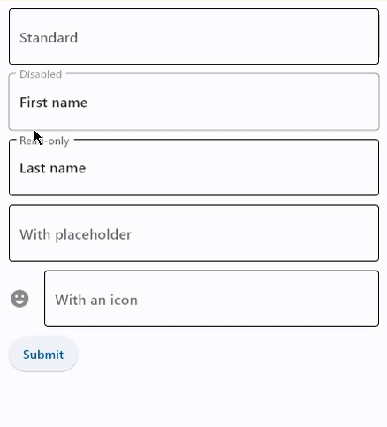
Basic Example#
import flet as ft


def main(page: ft.Page):
    def handle_button_click(e: ft.Event[ft.Button]):
        message.value = f"Textboxes values are:  '{tb1.value}', '{tb2.value}', "
        f"'{tb3.value}', '{tb4.value}', '{tb5.value}'."
        page.update()

    page.add(
        tb1 := ft.TextField(label="Standard"),
        tb2 := ft.TextField(label="Disabled", disabled=True, value="First name"),
        tb3 := ft.TextField(label="Read-only", read_only=True, value="Last name"),
        tb4 := ft.TextField(
            label="With placeholder", hint_text="Please enter text here"
        ),
        tb5 := ft.TextField(label="With an icon", icon=ft.Icons.EMOJI_EMOTIONS),
        ft.Button(content="Submit", on_click=handle_button_click),
        message := ft.Text(),
    )


ft.run(main)
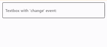
Handling change events#
import flet as ft


def main(page: ft.Page):
    def handle_field_change(e: ft.Event[ft.TextField]):
        message.value = e.control.value
        page.update()

    page.add(
        ft.TextField(
            label="Textbox with 'change' event:",
            on_change=handle_field_change,
        ),
        message := ft.Text(),
    )


ft.run(main)
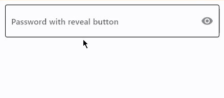
Password with reveal button#
import flet as ft


def main(page: ft.Page):
    page.add(
        ft.TextField(
            label="Password with reveal button",
            password=True,
            can_reveal_password=True,
        )
    )


ft.run(main)
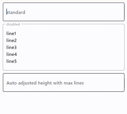
Multiline fields#
import flet as ft


def main(page: ft.Page):
    page.add(
        ft.TextField(
            label="Standard",
            multiline=True,
        ),
        ft.TextField(
            label="Disabled",
            multiline=True,
            disabled=True,
            value="line1\nline2\nline3\nline4\nline5",
        ),
        ft.TextField(
            label="Auto adjusted height with max lines",
            multiline=True,
            min_lines=1,
            max_lines=3,
        ),
    )


ft.run(main)
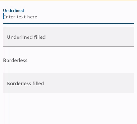
Underlined and borderless TextFields#
import flet as ft


def main(page: ft.Page):
    page.add(
        ft.TextField(
            label="Underlined",
            border=ft.InputBorder.UNDERLINE,
            hint_text="Enter text here",
        ),
        ft.TextField(
            label="Underlined filled",
            border=ft.InputBorder.UNDERLINE,
            filled=True,
            hint_text="Enter text here",
        ),
        ft.TextField(
            label="Borderless",
            border=ft.InputBorder.NONE,
            hint_text="Enter text here",
        ),
        ft.TextField(
            label="Borderless filled",
            border=ft.InputBorder.NONE,
            filled=True,
            hint_text="Enter text here",
        ),
    )


ft.run(main)
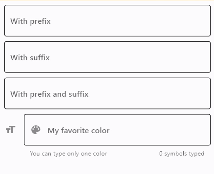
Setting prefixes and suffixes#
import flet as ft


def main(page: ft.Page):
    def handle_button_click(e: ft.Event[ft.Button]):
        message.value = f"Textboxes values are:  '{prefix_field.value}', "
        f"'{suffix_field.value}', '{prefix_suffix_field.value}', '{color_field.value}'."
        page.update()

    page.add(
        prefix_field := ft.TextField(label="With prefix", prefix="https://"),
        suffix_field := ft.TextField(label="With suffix", suffix=".com"),
        prefix_suffix_field := ft.TextField(
            label="With prefix and suffix",
            prefix="https://",
            suffix=".com",
            enable_interactive_selection=True,
        ),
        color_field := ft.TextField(
            label="My favorite color",
            icon=ft.Icons.FORMAT_SIZE,
            hint_text="Type your favorite color",
            helper="You can type only one color",
            counter="{value_length}/{max_length} chars used",
            prefix_icon=ft.Icons.COLOR_LENS,
            suffix="...is your color",
            max_length=20,
        ),
        ft.Button(content="Submit", on_click=handle_button_click),
        message := ft.Text(),
    )


ft.run(main)
Styled TextField#
import flet as ft


def main(page: ft.Page):
    page.padding = 50

    page.add(
        ft.TextField(
            text_size=30,
            cursor_color=ft.Colors.RED,
            selection_color=ft.Colors.YELLOW,
            color=ft.Colors.PINK,
            bgcolor=ft.Colors.BLACK26,
            filled=True,
            focused_color=ft.Colors.GREEN,
            focused_bgcolor=ft.Colors.CYAN_200,
            border_radius=30,
            border_color=ft.Colors.GREEN_800,
            focused_border_color=ft.Colors.GREEN_ACCENT_400,
            max_length=20,
            capitalization=ft.TextCapitalization.CHARACTERS,
        )
    )


ft.run(main)
Custom label, hint, helper, and counter texts and styles#
import flet as ft


def main(page: ft.Page):
    page.theme_mode = ft.ThemeMode.LIGHT

    def handle_field_change(e: ft.Event[ft.TextField]):
        message.value = e.control.value
        page.update()

    page.add(
        ft.TextField(
            on_change=handle_field_change,
            text_style=ft.TextStyle(
                size=15,
                italic=True,
                color=ft.Colors.DEEP_ORANGE_600,
                bgcolor=ft.Colors.LIME_ACCENT_200,
            ),
            label="Label",
            label_style=ft.TextStyle(
                size=17,
                weight=ft.FontWeight.BOLD,
                italic=True,
                color=ft.Colors.BLUE,
                bgcolor=ft.Colors.RED_700,
            ),
            hint_text="Hint",
            hint_style=ft.TextStyle(
                size=15,
                weight=ft.FontWeight.BOLD,
                italic=True,
                color=ft.Colors.PINK_ACCENT,
                bgcolor=ft.Colors.BROWN_400,
            ),
            helper="Helper",
            helper_style=ft.TextStyle(
                size=14,
                weight=ft.FontWeight.BOLD,
                color=ft.Colors.DEEP_PURPLE,
                bgcolor=ft.Colors.BLUE_50,
            ),
            counter="Counter",
            counter_style=ft.TextStyle(
                size=14,
                italic=True,
                color=ft.Colors.YELLOW,
                bgcolor=ft.Colors.GREEN_500,
            ),
        ),
        message := ft.Text(),
    )


ft.run(main)
Bases: FormFieldControl, AdaptiveControl
A text field lets the user enter text, either with hardware keyboard or with an onscreen keyboard.
adaptive: bool | None = None
Enables platform-specific rendering or inheritance of adaptiveness from parent controls.
animate_align: AnimationValue | None = None
Enables implicit animation of the [align][flet.LayoutControl.] property.
More information here.
animate_margin: AnimationValue | None = None
Enables implicit animation of the [margin][flet.LayoutControl.] property.
More information here.
animate_offset: AnimationValue | None = None
Enables implicit animation of the [offset][flet.LayoutControl.] property.
More information here.
animate_opacity: AnimationValue | None = None
Enables implicit animation of the [opacity][flet.LayoutControl.] property.
More information here.
animate_position: AnimationValue | None = None
Enables implicit animation of the positioning properties
([left][flet.LayoutControl.], [right][flet.LayoutControl.],
[top][flet.LayoutControl.] and [bottom][flet.LayoutControl.]).
More information here.
animate_rotation: AnimationValue | None = None
Enables implicit animation of the [rotate][flet.LayoutControl.] property.
More information here.
animate_scale: AnimationValue | None = None
Enables implicit animation of the [scale][flet.LayoutControl.] property.
More information here.
aspect_ratio: Number | None = None
The aspect ratio of the control. It is defined as the ratio of the width to the height.
autofill_hints: list[AutofillHint] | AutofillHint | None = (
    None
)
Helps the autofill service identify the type of this text input.
More information here.
autofocus: bool = False
True if the control will be selected as the initial focus. If there is more than one control on a page with autofocus set, then the first one added to the page will get focus.
bgcolor: ColorValue | None = None
TextField background color.
Note
Will not be visible if [filled][flet.FormFieldControl.] is False.
border_color: ColorValue | None = None
The border color.
Tip
Set to [Colors.TRANSPARENT][flet.] to invisible/hide the border.
border_width: Number | None = None
The width of the border in virtual pixels.
Defaults to 1.
Tip
Set to 0 to completely remove the border.
bottom: Number | None = None
The distance that the child's bottom edge is inset from the bottom of the stack.
Note
Effective only if this control is a descendant of one of the following:
[Stack][flet.] control, [Page.overlay][flet.] list.
can_reveal_password: bool = False
Displays a toggle icon button that allows revealing the entered password. Is shown
if both password and can_reveal_password are True.
The icon is displayed in the same location as suffix and in case both
can_reveal_password/password and suffix are provided, then the suffix is
not shown.
capitalization: TextCapitalization | None = None
Enables automatic on-the-fly capitalization of entered text.
Defaults to TextCapitalization.NONE.
col: ResponsiveNumber = 12
If a parent of this control is a [ResponsiveRow][flet.],
this property is used to determine
how many virtual columns of a screen this control will span.
Can be a number or a dictionary configured to have a different value for specific
breakpoints, for example col={"sm": 6}.
This control spans the 12 virtual columns by default.
Dimensions
| Breakpoint | Dimension |
|---|---|
| xs | <576px |
| sm | ≥576px |
| md | ≥768px |
| lg | ≥992px |
| xl | ≥1200px |
| xxl | ≥1400px |
content_padding: PaddingValue | None = None
The padding for the input decoration's container.
counter: StrOrControl | None = None
A Control to place below the line as a character count.
If None or an empty string then nothing will appear in the counter's location.
dense: bool | None = None
Whether this control is part of a dense form (ie, uses less vertical space).
disabled: bool = False
Every control has disabled property which is False by default - control and all
its children are enabled.
Note
The value of this property will be propagated down to all children controls recursively.
enable_suggestions: bool = True
Whether to show input suggestions as the user types.
This flag only affects Android. On iOS, suggestions are tied directly to
autocorrect, so that suggestions are only shown when autocorrect is True.
On Android autocorrection and suggestion are controlled separately.
Defaults to True.
error: StrOrControl | None = None
Text that appears below the input border.
If non-null, the border's color animates to red
and the [helper][flet.FormFieldControl.] is not shown.
error_style: TextStyle | None = None
The text style to use for [error][flet.FormFieldControl.].
Specifies whether/how this control should expand to fill available space in its parent layout.
More information here.
Note
Has effect only if the direct parent of this control is one of the following
controls, or their subclasses: [Column][flet.], [Row][flet.],
[View][flet.], [Page][flet.].
expand_loose: bool = False
Allows the control to expand along the main axis if space is available, but does not require it to fill all available space.
More information here.
Note
If expand_loose is True, it will have effect only if:
expandis notNoneand- the direct parent of this control is one of the following controls, or their
subclasses: [
Column][flet.], [Row][flet.], [View][flet.], [Page][flet.].
fill_color: ColorValue | None = None
Background color of TextField.
Note
Will not be visible if [filled][flet.FormFieldControl.] is False.
filled: bool | None = None
If True the decoration's container is filled with theme
[fill_color][flet.FormFieldControl.].
If filled=None (the default), then it is implicitly set to True when at least
one of the following is not None: [fill_color][flet.FormFieldControl.],
[focused_bgcolor][flet.FormFieldControl.],
[hover_color][flet.FormFieldControl.] and [bgcolor][flet.FormFieldControl.].
focused_bgcolor: ColorValue | None = None
Background color in focused state.
Note
Will not be visible if [filled][flet.FormFieldControl.] is False.
focused_border_color: ColorValue | None = None
Border color in focused state.
helper: StrOrControl | None = None
Text that provides context about the input's value, such as how the value will be used.
If non-null, the text is displayed below the input decorator, in the same location
as [error][flet.FormFieldControl.]. If a non-null
[error][flet.FormFieldControl.] value is specified then the helper text is not
shown.
helper_style: TextStyle | None = None
The text style to use for [helper][flet.FormFieldControl.].
hint_style: TextStyle | None = None
The text style to use for [hint_text][flet.FormFieldControl.].
hint_text: str | None = None
Text that suggests what sort of input the field accepts.
Displayed on top of the input when the it's empty and either
(a) [label][flet.FormFieldControl.] is None or (b) the input has the focus.
hover_color: ColorValue | None = None
Background color of TextField when hovered.
Note
Will not be visible if [filled][flet.FormFieldControl.] is False.
icon: IconDataOrControl | None = None
The icon to show before the input field and outside of the decoration's container.
input_filter: InputFilter | None = None
Provides as-you-type filtering/validation.
Similar to the on_change callback, the input filters are not applied when the
content of the field is changed programmatically.
keyboard_type: KeyboardType = TEXT
The type of keyboard to use for editing the text.
label: StrOrControl | None = None
Optional text that describes the input field.
When the input field is empty and unfocused, the label is displayed on top of the input field (i.e., at the same location on the screen where text may be entered in the input field). When the input field receives focus (or if the field is non-empty) the label moves above, either vertically adjacent to, or to the center of the input field.
left: Number | None = None
The distance that the child's left edge is inset from the left of the stack.
Note
Effective only if this control is a descendant of one of the following:
[Stack][flet.] control, [Page.overlay][flet.] list.
max_length: int | None = None
Limits a maximum number of characters that can be entered into TextField.
max_lines: int | None = None
The maximum number of lines to show at one time, wrapping if necessary.
This affects the height of the field itself and does not limit the number of lines that can be entered into the field.
If this is 1 (the default), the text will not wrap, but will scroll horizontally
instead.
min_lines: int | None = None
The minimum number of lines to occupy when the content spans fewer lines.
This affects the height of the field itself and does not limit the number of lines that can be entered into the field.
Defaults to 1.
offset: OffsetValue | None = None
Applies a translation transformation before painting the control.
The translation is expressed as an Offset scaled to the control's size.
So, Offset(x=0.25, y=0), for example, will result in a horizontal translation
of one quarter the width of this control.
Example
The following example displays container at 0, 0 top left corner of a stack as
transform applies -1 * 100, -1 * 100 (offset * control's size) horizontal and
vertical translations to the control:
on_animation_end: (
    ControlEventHandler[LayoutControl] | None
) = None
Called when animation completes.
Can be used to chain multiple animations.
The data property of the event handler argument contains the name
of the animation.
More information here.
on_blur: ControlEventHandler[TextField] | None = None
Called when the control has lost focus.
on_change: ControlEventHandler[TextField] | None = None
Called when the typed input for the TextField has changed.
on_focus: ControlEventHandler[TextField] | None = None
Called when the control has received focus.
on_submit: ControlEventHandler[TextField] | None = None
Called when user presses ENTER while focus is on TextField.
opacity: Number = 1.0
Defines the transparency of the control.
Value ranges from 0.0 (completely transparent) to 1.0 (completely opaque
without any transparency).
parent: BaseControl | None
The direct ancestor(parent) of this control.
It defaults to None and will only have a value when this control is mounted
(added to the page tree).
The Page control (which is the root of the tree) is an exception - it always
has parent=None.
prefix: StrOrControl | None = None
A Control to place on the line before the input.
It appears after the [prefix_icon][flet.FormFieldControl.], if both are specified.
This can be used, for example, to add some padding to text that would otherwise be
specified using prefix, or to add a custom control in front of the input.
The control's baseline is lined up with the input baseline.
prefix_icon: IconDataOrControl | None = None
An icon that appears before the editable part of the text field, within the decoration's container.
If [prefix][flet.FormFieldControl.] is specified and visible,
this icon will appear to its left.
prefix_style: TextStyle | None = None
The text style to use for [prefix][flet.FormFieldControl.].
read_only: bool = False
Whether the text can be changed.
When this is set to True, the text cannot be modified by any shortcut or keyboard
operation. The text is still selectable.
Defaults to False.
right: Number | None = None
The distance that the child's right edge is inset from the right of the stack.
Note
Effective only if this control is a descendant of one of the following:
[Stack][flet.] control, [Page.overlay][flet.] list.
rotate: RotateValue | None = None
Transforms this control using a rotation around its center.
The value of rotate property could be one of the following types:
number- a rotation in clockwise radians. Full circle360°ismath.pi * 2radians,90°ispi / 2,45°ispi / 4, etc.Rotate- allows to specify rotationangleas well asalignment- the location of rotation center.
scale: ScaleValue | None = None
Scales this control along the 2D plane. Default scale factor is 1.0,
meaning no-scale.
Setting this property to 0.5, for example, makes this control twice smaller,
while 2.0 makes it twice larger.
Different scale multipliers can be specified for x and y axis, by setting
Control.scale property to an instance of Scale class.
Either scale or scale_x and scale_y could be specified, but not all of them.
shift_enter: bool = False
Changes the behavior of Enter button in multiline TextField to be chat-like,
i.e. new line can be added with Shift+Enter and pressing just Enter fires
on_submit event.
smart_dashes_type: bool = True
Whether to allow the platform to automatically format dashes.
This flag only affects iOS versions 11 and above. As an example of what this does, two consecutive hyphen characters will be automatically replaced with one en dash, and three consecutive hyphens will become one em dash.
Defaults to True.
smart_quotes_type: bool = True
Whether to allow the platform to automatically format quotes.
This flag only affects iOS. As an example of what this does, a standard vertical double quote character will be automatically replaced by a left or right double quote depending on its position in a word.
Defaults to True.
suffix: StrOrControl | None = None
A Control to place on the line after the input.
It appears before the [suffix_icon][flet.FormFieldControl.],
if both are specified.
This can be used, for example, to add some padding to the text that would otherwise
be specified using suffix, or to add a custom control after the input.
The control's baseline is lined up with the input baseline.
suffix_icon: IconDataOrControl | None = None
An icon that appears after the editable part of the text field and after the
[suffix][flet.FormFieldControl.], within the decoration's container.
suffix_style: TextStyle | None = None
The text style to use for [suffix][flet.FormFieldControl.].
text_align: TextAlign | None = None
How the text should be aligned horizontally.
Defaults to TextAlign.LEFT.
The [TextStyle][flet.] to use for the
text being edited.
text_vertical_align: VerticalAlignment | Number | None = (
    None
)
Defines how the text should be aligned vertically.
Value can either be a number ranging from -1.0 (topmost location) to 1.0
(bottommost location) or of type [VerticalAlignment][flet.]
Defaults to VerticalAlignment.CENTER.
tooltip: TooltipValue | None = None
The tooltip ot show when this control is hovered over.
top: Number | None = None
The distance that the child's top edge is inset from the top of the stack.
Note
Effective only if this control is a descendant of one of the following:
[Stack][flet.] control, [Page.overlay][flet.] list.
visible: bool = True
Every control has visible property which is True by default - control is
rendered on the page. Setting visible to False completely prevents control (and
all its children if any) from rendering on a page canvas. Hidden controls cannot be
focused or selected with a keyboard or mouse and they do not emit any events.
Called once during control initialization to define its child controls. self.page is available in this method.