TimePicker
Examples#
Basic Example#
import flet as ft
def main(page: ft.Page):
page.horizontal_alignment = ft.CrossAxisAlignment.CENTER
def handle_change(e: ft.Event[ft.TimePicker]):
page.add(ft.Text(f"TimePicker change: {time_picker.value}"))
def handle_dismissal(e: ft.Event[ft.TimePicker]):
page.add(ft.Text(f"TimePicker dismissed: {time_picker.value}"))
def handle_entry_mode_change(e: ft.TimePickerEntryModeChangeEvent):
page.add(ft.Text(f"TimePicker Entry mode changed to {e.entry_mode}"))
time_picker = ft.TimePicker(
confirm_text="Confirm",
error_invalid_text="Time out of range",
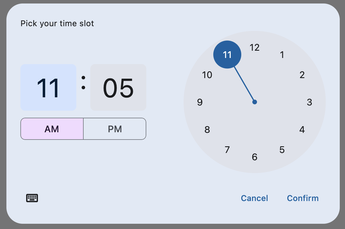
help_text="Pick your time slot",
on_change=handle_change,
on_dismiss=handle_dismissal,
on_entry_mode_change=handle_entry_mode_change,
)
page.add(
ft.Button(
content="Pick time",
icon=ft.Icons.TIME_TO_LEAVE,
on_click=lambda _: page.show_dialog(time_picker),
)
)
ft.run(main)
Bases: DialogControl
A Material-style time picker dialog.
Can be opened by calling page.show_dialog() method.
Depending on the time_picker_entry_mode, it will show either a Dial or
an Input (hour and minute text fields) for picking a time.
adaptive: bool | None = None
Enables platform-specific rendering or inheritance of adaptiveness from parent controls.
cancel_text: str | None = None
The text that is displayed on the cancel button. The default value is "Cancel".
col: ResponsiveNumber = 12
If a parent of this control is a [ResponsiveRow][flet.],
this property is used to determine
how many virtual columns of a screen this control will span.
Can be a number or a dictionary configured to have a different value for specific
breakpoints, for example col={"sm": 6}.
This control spans the 12 virtual columns by default.
Dimensions
| Breakpoint | Dimension |
|---|---|
| xs | <576px |
| sm | ≥576px |
| md | ≥768px |
| lg | ≥992px |
| xl | ≥1200px |
| xxl | ≥1400px |
confirm_text: str | None = None
The text that is displayed on the confirm button. The default value is "OK".
disabled: bool = False
Every control has disabled property which is False by default - control and all
its children are enabled.
Note
The value of this property will be propagated down to all children controls recursively.
error_invalid_text: str | None = None
The error message displayed below the input text field if the input is not a valid hour/minute. The default value is "Enter a valid time".
Specifies whether/how this control should expand to fill available space in its parent layout.
More information here.
Note
Has effect only if the direct parent of this control is one of the following
controls, or their subclasses: [Column][flet.], [Row][flet.],
[View][flet.], [Page][flet.].
expand_loose: bool = False
Allows the control to expand along the main axis if space is available, but does not require it to fill all available space.
More information here.
Note
If expand_loose is True, it will have effect only if:
expandis notNoneand- the direct parent of this control is one of the following controls, or their
subclasses: [
Column][flet.], [Row][flet.], [View][flet.], [Page][flet.].
help_text: str | None = None
The text that is displayed at the top of the header.
This is used to indicate to the user what they are selecting a time for. The default value is "Enter time".
hour_label_text: str | None = None
The text that is displayed below the hour input text field.
The default value is "Hour".
minute_label_text: str | None = None
The text that is displayed below the minute input text field.
The default value is "Minute".
on_change: ControlEventHandler[TimePicker] | None = None
Called when user clicks confirm button. value property is updated with selected
time. e.data also contains the selected time.
on_dismiss: ControlEventHandler[DialogControl] | None = None
Called when dialog is dismissed.
on_entry_mode_change: (
    EventHandler[TimePickerEntryModeChangeEvent] | None
) = None
Called when the time_picker_entry_mode is changed.
opacity: Number = 1.0
Defines the transparency of the control.
Value ranges from 0.0 (completely transparent) to 1.0 (completely opaque
without any transparency).
parent: BaseControl | None
The direct ancestor(parent) of this control.
It defaults to None and will only have a value when this control is mounted
(added to the page tree).
The Page control (which is the root of the tree) is an exception - it always
has parent=None.
time_picker_entry_mode: TimePickerEntryMode | None = None
The initial mode of time entry method for the time picker dialog.
Defaults to TimePickerEntryMode.DIAL.
tooltip: TooltipValue | None = None
The tooltip ot show when this control is hovered over.
The selected time that the picker should display. The default value is equal to the current time.
visible: bool = True
Every control has visible property which is True by default - control is
rendered on the page. Setting visible to False completely prevents control (and
all its children if any) from rendering on a page canvas. Hidden controls cannot be
focused or selected with a keyboard or mouse and they do not emit any events.
Called once during control initialization to define its child controls. self.page is available in this method.